Haha Haha Co.

Strategy

A client shifted its market focus — and needed a new brand to support it.

Situation

A client with a long history in the ophthalmology space found itself at a crossroads: It had established a reputation as a leader in osmolarity testing, but planned to expand into the broader realm of corneal health. It made a bold decision to rebrand from the foundation up – including changing its name.

trukera logos

Goals

  • Successfully navigate the company through this crucial transition
  • Develop a new name aligned with the company’s goals
  • Create a new logo, identity package, brand guidelines and graphic standards
  • Relaunch the brand with a campaign that explained the new name, communicated the expansion into corneal health, and elevated the company’s brand presence
  • Launch the new brand in time for an important annual trade show

Strategy

Equipped with an extensive depth of experience in the vision and ophthalmology space, Hahahaha drew up a plan to move the client forward quickly. We began to develop the new name and identity, while simultaneously crafting the preliminary advertising concepts and media strategies. Executing these efforts in tandem would enable us to meet aggressive deadlines and accelerate time to market — while ensuring that everyone had adequate time for development, review and revision of all the pieces of the puzzle.

images of eyeballs

Solution

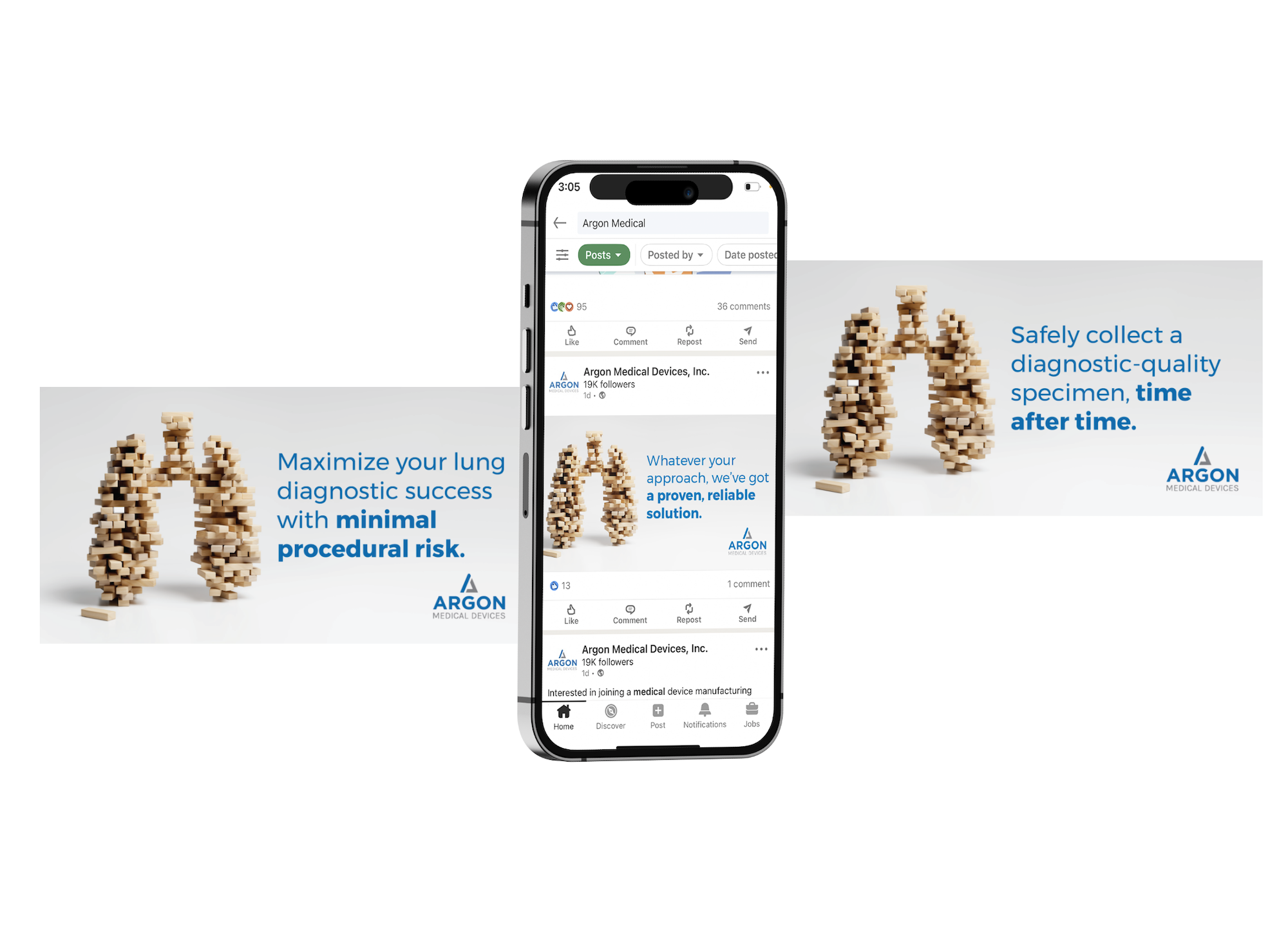
The company relaunched under the name Trukera, derived from “true + cornea”. This enabled Trukera to emphasize its total commitment to corneal care in bringing solutions to market that help providers objectively diagnose, manage and advance the health of the cornea. The color choice behind the logo’s green color palette was especially intentional, as a nod to the coloring of a healthy cornea found on a topographic map.

The new advertising campaign unveiled the company’s evolved focus with a memorable tagline: It’s amazing how much rides on something so small. The accompanying images depicted the 12mm diameter of the average cornea.

Along the way, Hahahaha added touches to lift the client’s advertising above the competition. For example, we chose a color scheme that broke the sea of blue that typified the industry. In addition, our creative executions diverted from the industry norm of depicting close-up images of the eye. The result: Bold, simple and clear creative that cut through the clutter.

Results

By pursuing the naming and creative portions of the assignment in tandem, Hahahaha helped the client launch in time for the annual American Academy of Ophthalmology (AAO) show. The new name and strategy garnered a positive response from both new and existing customers.

trukera callout

Summary

Hahahaha leveraged expertise in healthcare, brand strategy, and design to move the client forward quickly, and differentiate them from a crowded landscape of “look alike” brands. By clearly defining its focus and standing apart from the clutter, Trukera is on a solid path for staking out its territory in the realm of corneal care.

Bringing the conversation to light around depression and suicide so that no one suffers in darkness

In 2014, the Jordan Elizabeth Harris Foundation was created on the principle of bringing the conversation to light around mental health, specifically depression and suicide, after the tragic loss of Jordan Elizabeth Harris. Suicide is the 12th leading cause of death in the United States with approximately 1.2 million suicide attempts every year. Yet the stigma around depression and suicide remains. In order to fight these harrowing statistics, Hahahaha had the honor of partnering with the JEHF in 2022 to support and promote their second Light the Trail Ride.

Light the Trail Biking

The Ride: A 1,800 mile journey of hope

The Light the Trail Ride is a cross country biking excursion that is supported by riders and donors who wish to pledge their time and support to bring awareness and reduce the stigma of depression and suicide. It is the cornerstone effort of the JEHF and the ride strives to encourage supporters to share their stories and give others all over the country a safe place to speak about their experiences with mental health. Between the two rides in 2017 and 2022, The Jordan Elizabeth Harris Foundation has raised significant funding and awareness around the gravity of this topic and been able to support continued research focused on treating depression, suicide prevention training, creating resources and facilitating education opportunities. 

Couple of cyclists for light the trail
L: Charlie Howlett, Deb Zinderler (Z2 Marketing) and Cory Zimmerman (Z2 Marketing)
R: Tom & Ellen Harris, Founders of the Jordan Elizabeth Harris Foundation

Hahahaha had the privilege of serving as the marketing partner of LTTR to promote their second ride in 2022. They came to us with a challenge in lack of awareness and support of the their efforts, and we were able to work together through strategic planning, digital asset development and collateral material creation to re-launch the Ride because it aligns with our values as an agency and we were able to share our expertise and skillset. In addition, Hahahaha saw the opportunity to bring this crucial event to life in the eyes of more people through a documentary film and trailer. Available budget was an obstacle, however Hahahaha was compelled to support this initiative and solicited a like minded partner out of Milwaukee, WI called Z2 Marketing who was willing to provide supporting video production services in exchange for involvement with this powerful initiative. Hahahaha was able to donate the remainder of investment to continue bringing the Light the Trail mission to life. What followed was the production of a documentary that captures the riders along their journey in addition to their own personal, compelling stories. This video further advances the mission of Light the Trail and the Jordan Elizabeth Harris Foundation, and Hahahaha’s goal through these collective efforts was to walk alongside this inspirational team to make their event a success and champion their cause.

Cycling Group light the trail

User experience and activation of the #Ride4 effort

Another key motivator around the effort is the promotion and honor of the #Ride4’s of each rider and the community at large. This is a unique way that the riders and the foundation overall can bring the stories forward of loved ones whos lives have been tragically taken as a result of suicide. Hahahaha had a unique opportunity to strategize the best way to promote the submission of Ride4’s and prioritize their position on the website to encourage form fills and subsequent promotion of these empowering tributes on the LTT social media pages. 

Cycling Group light the trail

Hahahaha implemented numerous functional and user experience updates to create a more seamless tool to promote and accept donations in advance of the ride, as well as encourage Ride4 submission and sponsorship form fill. In addition to these optimizations, Hahahaha also streamlined the Foundation’s existing CRM to further encourage passionate individuals to get involved with the next Ride and the Foundation overall. 

Light the Trail Website mockup

Elevating the user experience and showcasing excellence

In addition to digital services, it was important to the client that Hahahaha provide traditional marketing services that properly married the digital presence with the real life iteration of the brand and its mission. The Hahahaha Account Service and Creative team worked closely alongside the Foundation’s team to ensure a delivery of marketing support materials that communicated the very real impact that mental health has on people and manifested this in printed one pager material, bike shop promotional flyers, and a rebuild of the LTT primary logo for 2022 that would support ongoing efforts for the team internally as they navigated the route in real time.

Light the trail mobile campaign

Overall, the sentiment behind this impactful project is the direct alignment with Hahahaha’s mission and ultimate goal to Make Life Better. It’s at the core of what we do and a foundational piece of how we interact with and serve our clients, our partners, and our colleagues inside and outside of work. The Jordan Elizabeth Harris Foundation and the Light the Trail initiative are a real life embodiment of this mission and we’re proud to call them partners in work that truly matters, and to have played a small part in making this event a success.

Light the Trail map

Get involved or share your story

Whether you participate in a future Light the Trail Ride, make a donation, or share a story, you are helping bring the conversation around mental illness and suicide awareness to light and bringing us one step closer to living in a world where suicide is never the choice.

If you or someone you know is experiencing suicidal thoughts or a crisis, help is available. Please dial 988 for support via the suicide prevention hotline.

Crafting a distinctive brand and web presence for Bennett Partners

At Hahahaha, we embarked on a meaningful partnership with Bennett Partners, an esteemed architecture, interiors, and planning firm based in Fort Worth, Texas. Guided by their unwavering dedication to responsible preservation and urban design, Bennett Partners strives to create sustainable spaces that enhance and sustain communities. What began as an initiative to enhance their website and showcase their award-winning work evolved into a comprehensive brand refresh, a testament to our shared commitment.

Bennet Partners logo

Navigating transitions and embracing a thoughtful ethos

Recognizing Bennett Partners’ esteemed reputation and shared mission to improve lives within the Fort Worth community, we embarked on a collaborative journey with their team of award-winning designers. This partnership provided a unique opportunity to collaborate with like-minded creatives who valued a strategic approach. Following the departure of a former partner, our goal was to develop a new brand identity that authentically reflected Bennett Partners’ thoughtful ethos, starting with a strategic renaming process.

Bennett Partners logo

Our recommendation was to preserve the equity of the original name, Bennett Benner Partners, by preserving the namesake Bennett as a prominent element. Thus, the name Bennett Partners was chosen, capturing the essence of a collective of passionate partners united by their mission and dedication to thoughtful design.

Benner Partners mobile

From typography to tone: crafting an approachable identity

We meticulously crafted a comprehensive system of logos and a versatile color palette, offering both flexibility and consistency. Our brand design centered around sophistication, simplicity, and purpose, harmonizing seamlessly with Bennett Partners’ core values. The logo showcases a modern, customized typeface that enhances the letterforms, set in lowercase to reflect the brand’s friendly and approachable nature. The secondary logo variation was refined to include “architecture, interiors, planning,” providing clarity about the services offered. Our expanded color palette embraces softer, thoughtful, and intricate color variations, featuring shades of blue and orange that distinguish Bennett Partners within the industry. These colors effortlessly integrate into diverse project plans and graphics. Additionally, we established a comprehensive brand toolkit, empowering Bennett Partners to effectively convey their unique identity.

website before and after

Elevating the user experience and showcasing excellence

Following the brand refresh, Bennett Partners sought a website redesign that would seamlessly showcase their exceptional work, engage users, and mirror their commitment to responsible architecture and community impact. Frustrated by their previous website’s inability to communicate their core values and meet their business needs, the objective of the new website was clear: effectively communicate their mission, prioritize their team members, and empower them to effortlessly showcase new projects. The final website encompasses key elements such as a visually striking portfolio, improved organization and categorization, seamless content management, responsive design, and personalized employee pages. Our team at Hahahaha delivered a fully customized website with a clean and flexible modular system, enhancing navigation and user interaction to improve their online presence and reinforce their position as an industry leader.

Bennett Partners web images

Results

The partnership between Hahahaha and Bennett Partners led to a successful transformation of their brand and website, capturing their expertise and unwavering commitment to responsible architecture. Through the reimagined brand identity, Bennett Partners’ captivating story resonates, attracting new business opportunities within their region. By collaborating closely with our team, Bennett Partners achieved a brand and website presence that authentically reflects their excellence in architecture and design, solidifying their position as a leading firm within the industry.

Amplifying Perot Jain’s impact with the perfect balance of strategy, design, and technology

Perot Jain, a venture capital firm specializing in early-stage capital funding, is intentional about investing in innovative companies that are developing disruptive, best-in-class solutions. Founded by the collaboration of Ross Perot, Jr. and Anurag Jain, Perot Jain focuses on funding leading-edge companies in the mobility innovation, healthcare, and real estate sectors. With a long history of entrepreneurial success and a strong infrastructure in place, Perot Jain sought to convey their unique approach to venture capital. Unlike other firms, their investment support goes beyond capital and extends to mentorship, access, and alliances within the Perot and Jain family of companies, including Access Healthcare, Hillwood, and the Mobility Innovation Zone. It became evident they needed to enhance their brand identity, create a distinct positioning, and develop a new website that would effectively communicate their unique value proposition.

Through their relationship with Hillwood and the AllianceTexas Mobility Innovation Zone, Perot Jain had already established a rapport with Hahahaha, leading them to choose the agency for this significant brand transformation initiative. With a shared vision, Perot Jain and Hahahaha embarked on a journey to redefine the venture capital firm’s brand strategy, positioning, and visual identity, ultimately showcasing their commitment to investing in and mentoring disruptive companies that have the potential to shape the future.

Featured Case Study

Innovation from the ground up

Mobility and innovation districts are places where pioneers make critical advancements in logistics and supply chain modernization. It’s also a place where technology breakthroughs are developed that can affect billions of people. They are critical to advancing how consumer and…

From mission to position: uncovering Perot Jain’s unique differentiators

Hahahaha initiated a full brand strategy initiative, delving into Perot Jain’s organizational mission and identifying their unique positioning compared to other VC firms. Collaboratively, the team identified the key values and advantages that set Perot Jain apart: collaboration, authenticity, a straightforward approach, leadership, entrepreneurial success, strong infrastructure, and partnerships/alliances. This thorough understanding formed the basis for a strategy that would effectively communicate Perot Jain’s strengths and resonate with their target audience. The strategy aimed to convey success stories and the current portfolio, positioning Perot Jain as an organization focused on investing in innovative companies aligned with their parent organizations’ business goals.

Building on the strategic foundation, Hahahaha developed a brand archetype recommendation, selecting the Hero archetype. This choice aligned with Perot Jain’s commitment to investing in and mentoring innovative companies that aim to improve their industries and the world. This archetype dovetailed seamlessly into the positioning recommendation, Transformational, and a powerful positioning statement that highlighted the art and science of experienced entrepreneurialism, emphasizing Perot Jain’s role in driving transformative change.

Uniting Perot Jain’s positioning with a captivating brand identity and website

To visually represent the brand, Hahahaha designed a logo and brand identity that perfectly balanced the Perot and Jain family names. The logo mark, a harmonious integration of ‘P’ and ‘J,’ symbolized the partnership between Perot Jain and the companies they support. The customized letterforms, with their subtly rounded edges, reinforced the logo mark and evoked a sense of balance and synergy. The animated version of the logo added dynamism and represented movement within the brand. 

Perot Jain logos

With the positioning and brand identity as a solid foundation, the website was crafted to build the brand’s presence online. The website’s information architecture (IA) was thoughtfully developed to feature Perot Jain’s portfolio of companies, leveraging the legacy of Perot and Jain ventures and driving a holistic conversation. The modular page structure empowered Perot Jain to easily expand and update content, ensuring long-term scalability and independence. The comprehensive portfolio system showcased Perot Jain’s wide-ranging investments, offering a clear demonstration of their expertise. The visually captivating website, with its compelling imagery, videos, and clean typography, wowed potential clients and instilled trust and credibility. The website’s design, catering to both desktop and mobile experiences seamlessly, ultimately provided a modern and future-ready platform.

Investing that Transforms - Perot Jain

Results: driving success and solidifying market presence

The results of this brand transformation were significant. Perot Jain’s new brand identity positioned them as a global competitor, attracting potential customers and garnering increased visibility among relevant venture capital partners. Perot Jain now has a solid foundation for all future communications, driving continued success in attracting high-quality deals and fostering partnerships that align with their growth goals. In essence, Hahahaha’s partnership with Perot Jain exemplifies the transformative power of strategic brand positioning and creative excellence. By combining insights, innovative design, and a client-centric approach, Hahahaha has enabled Perot Jain to elevate their brand to new heights, solidifying their position as a trailblazing force within the venture capital landscape.

Perot Jain on cell phone

Reinventing VoidForm’s brand for the future

With over 40 years of experience, VoidForm Products is a trusted business specializing in customized, innovative carton void forms that protect structures from the damaging impact of expansive soils. Their extensive range of products is designed to provide added fortification during concrete foundation pouring, offering a cost-effective and reliable solution for both residential and large-scale commercial projects. Though sales were strong, VoidForm faced the challenge of an outdated and disjointed brand ecosystem encompassing the parent brand and over 20 sub-brands. Recognizing the need for a modern, scalable, and cohesive brand strategy to support their increased business goals, VoidForm partnered with Haha Haha to position themselves as an industry thought-leader and support the expansion of their products and services.

VoidForm Logo

Embracing VoidForm’s unique circumstances as a long-standing enterprise, Hahahaha recognized the challenge of working with a brand ecosystem that was built over time. VoidForm had yet to take a comprehensive top-down view of their branding and marketing approach and how it could support the future of the business. Hahahaha served as a pivotal partner for this rapidly growing company, providing support during leadership changes, aligning their history and success with a modern approach, and creating a future-focused brand strategy and web presence for sustained growth.

VoidForm Design Assets

Elevating protection and stability: uncovering VoidForm’s key differentiators and core values

Hahahaha embarked on a comprehensive brand refresh, starting with an assessment of the brand positioning and hierarchy. This strategic approach began with a deep dive into VoidForm’s brand landscape, including identifying key differentiators for the company and each product, reflecting on the company’s core values, and understanding key target audiences and what compels them.

VoidForm on Mobile

As a result, the Hero archetype was selected as the perfect fit for VoidForm. This archetype captured VoidForm’s commitment to delivering best-in-class solutions and leading the industry with products that outperformed the competition. To complement this, Hahahaha introduced the powerful positioning of “Safeguard” into VoidForm’s brand language, embodying the essence of their products which provide an invaluable measure of protection and stability in expansive or complex soil structures with customizable, easy-to-install, quality forms.

Building upon this foundation, brand language was enhanced to include the main line “Protect Your Project,” which positioned the product appropriately and served as a strong call to action. The brand voice was defined as determined, confident, innovative, dependable, trustworthy and approachable, which served to influence the way the brand is expressed in writing.

VoidForm Expanded Logo

Unifying identity and differentiation: the cohesive visual system for VoidForm

Hahahaha implemented a cohesive visual system that combined the branded house and sub-brands strategies, enabling VoidForm to effectively showcase their individual product offerings while maintaining brand recognition. The brand system was built to support the seamless integration of new products, allowing VoidForm the ability to easily launch new, innovative solutions and meet the needs of their customers. The logos were designed to be simple, functional, and easily recognizable, with the updated mark serving as a monogram of their initials where the negative space creates a void – a key feature behind the strength of each product. The vibrant orange color, an integral part of their original palette, honored their history while presenting a modern and impactful identity. A comprehensive guideline was created to ensure long-term internal alignment and consistent brand usage across all products.

Embracing creativity, enhancing user experience: the transformative website redesign

To complete the brand transformation, Hahahaha tackled the challenge of creating a visually stunning and user-friendly website for VoidForm. Despite the initial lack of strong image assets, the team embraced creativity and ingenuity by utilizing stock imagery to develop custom brand assets inspired by VoidForm’s products. The website redesign resulted in an appealing and intuitive interface that catered to both laypersons and experienced engineers, effectively conveying information and specifications while providing an engaging user experience. Integration with Google Analytics supported awareness, engagement, and lead generation objectives, while the addition of a gated content section facilitated the seamless migration of existing coursework and offerings. The implementation of a content management system empowered VoidForm’s internal team to easily update and maintain the website for long-term adaptability.

VoidForm Website

Results

The collaboration between Hahahaha and VoidForm during a pivotal time yielded remarkable outcomes. Overall, Hahahaha’s partnership with VoidForm Products supported their growth by aligning their history and success with a modernized brand strategy and web presence. The new brand system and website positioned VoidForm as an industry leader, and the comprehensive implementation and widespread adoption of the brand by the internal team demonstrated the empowering strength and impact of the brand refresh initiative.

For the TearCare® System, a crucial step in promoting their solution was to become an advocate for change.

Situation

At first glance, dry eye disease (DED) sounds like a mere inconvenience. However, left untreated, this chronic, progressive condition can impact the vision, surgical outcomes and quality of life of millions of patients. Even though meibomian gland dysfunction (MGD) is the most prevalent form of dry eye, in-office procedures to address it are relatively new — and none are reimbursed by insurers. As a result, only patients who can cover the out-of-pocket expense receive treatment.

The TearCare® System is designed to address MGD by evacuating obstructed glands using therapeutic heat and natural blink responses. However, to gain wider adoption, fair reimbursement was needed. The company sought to change reimbursement policies and broaden access to care by raising awareness of the situation. TearCare® tapped Hahahaha to lead this effort.

Tearcare magazine ad and staff holding signs

Goals

  • Reiterate the threats associated with MGD
  • Raise broad, industry-wide awareness of current compensation and reimbursement limitations
  • Reach an array of stakeholders with a message of “Fair Access”
  • Rally the market to support reimbursement and accessibility for the benefit of patients, practices and payors
  • Increase awareness of the TearCare® System
Tearcare magazine ad and staff holding megaphones

Strategy

The client was ready to promote the need for change and had allocated resources to do it. However, to truly influence the market, the brand also needed to demonstrate the growing support of this movement from eye care professionals (ECPs), patients, employers and other key constituents.

Solution

To convey this message, Hahahaha created a campaign that captured the feel of a public protest or political rally. In each execution, a real ECP, patient or eye care industry figure appeared with a sign that read “MGD Care Is Not Fair For All.”

Using precise targeting, Hahahaha reached optometrists, administrators, payors and other audiences with a “protester/spokesperson” relevant to them. Using faces and names that are known throughout the industry helped build momentum over time, and, ultimately, drove awareness over the top. 

Tearcare ads

Results

By cutting through the clutter of standard medical device advertising, the campaign achieved a high degree of visibility and effectiveness. Within the first few months, the brand realized noticeable results, including:

  • 31K new users to the mytearcare.com site
  • 228 new requests for information on the TearCare® System from qualified users

More importantly, the industry is becoming aware of the need to recognize MGD as a reimbursable procedure — which is a crucial first step to change.

Summary

In this campaign, we effectively humanized a client’s treatment. Rather than promoting features and benefits of a specific solution, we showed the basic need for access to care — and the simple lack of fairness of not covering a widespread condition. We made the cause personal by featuring people our audiences knew — and who unquestionably held the best interests of patients and ECPs as a top priority.

How we helped NCODA translate membership benefits into an actionable message —
and surpass goals by 3X.

trade show

Situation

NCODA is an organization that provides resources, events and educational opportunities that enable oncologists, oncology pharmacists, healthcare professionals, pharmaceutical companies and healthcare students to connect and collaborate for optimal cancer patient outcomes. However, low awareness was keeping the organization from realizing its full potential as an information hub for HCPs seeking unbiased information on innovative oral and IV cancer treatments, as well as career-building tips to keep them engaged in this vital specialty.

Initially, Haha Haha was enlisted to help drive awareness of the organization and its full suite of benefits. As the campaign progressed, internal business priorities shifted from awareness to membership growth. Hahahaha partnered with NCODA to determine how to best adapt the current in-market campaign to aligning with the goal of growing the organization’s base through new member sign ups.

doctors

Goals

  • Expand awareness of the organization, its mission and its extensive array of
    member benefits
  • Distill an extensive and complex array of member benefits into a succinct,
    motivating message
  • Adapt to changing priorities by shifting the campaign focus from brand awareness
    to new memberships
  • Drive new memberships through paid media

Strategy

To drive awareness, Hahahaha initially developed a strategy that helped humanize the organization by speaking directly to the membership about the difference that interaction and collaboration can make. The aim was to communicate that by joining NCODA, you’re collaborating and connecting with the best minds in the industry – and helping further advances in cancer care. The message was delivered through an omni-channel campaign — a first for the client.

name tags

Solution

Hahahaha delivered a campaign and helped control creative costs by photographing actual NCODA members who were attending a scheduled conference. By using actual members, we were able to communicate in a realistic and convincing manner how NCODA helped members benefit by staying connected and tuned in to the latest developments in oncology.

When the business priorities changed the focus of the campaign from awareness to membership enrollment, our media efforts easily adapted to the new direction; it was a matter of moving an already interested audience toward signing up. The Hahahaha team responded with speed and agility, making seamless changes to the existing digital assets. We then quickly set a tangible new member goal using estimates based on our experience with average costs per acquisition (CPA).

The revised media strategy was launched — and quickly surpassed expectations.

doctors

Results

All clients have finite resources. For NCODA, the limitations of total media dollars were more pronounced than usual. This challenge was something Hahahaha was ready and able to overcome. As a result, building a symbiotic creative and media strategy was key to expanding the brand’s awareness and significantly exceed membership goals in record time.

  • Exceeded paid media membership projections by 3X
  • Surpassed assisted conversion goal
  • Attracted new users to the NCODA website through paid media
  • 74% of all member enrollment page views were generated from paid media

Summary

Hahahaha met the initial task of distilling a very robust array of benefits into an easy-to-digest creative and media strategy. But when the strategy shifted to membership, we illustrated our ability to provide significant real bottom-line value. Our agility and flexibility enabled us to quickly re-tool our approach, then develop a media strategy that exceeded all projections. Working within a limited budget, the agency was able to leverage the client’s marketing dollars as effectively as possible. In the end, we clearly illustrated the type of ROI that could be generated by a smart, results-oriented campaign.

Podimetrics had a strong story to tell
— and a new brand to build

Podimetrics Brand Logos

Situation

Diabetes is one of the top health issues in the United States. In fact, costs for diabetes care are more than 400% higher than cancer. One of the leading drivers of that cost is amputation resulting from Diabetic Foot Ulcers (DFUs), which results in a limb being amputated every four minutes due to diabetes.

To combat this, Podimetrics developed a web-enabled, remote temperature monitoring system designed to identify the risk of DFUs before symptoms are visibly present — and drive significant cost savings by avoiding costly amputations.

Hahahaha took the reins on translating this innovative system into a compelling narrative that would reach key audiences and encourage payor adoption.

Goals: 

  • Support the market launch of a new, breakthrough product
  • Differentiate Podimetrics from competing solutions
  • Explain the system and its benefits to payors and HCPs
  • Support rollout to a low-tech patient base with clear, user-friendly materials
Podimetrics Materials

Strategy

Our team was tasked with creating a new brand and executing multi-channel communications to differentiate Podimetrics and drive sales conversations.

To reach the various audiences, we decided that two specific objectives must be achieved: First, the brand story must be humanized and brought to life in a manner that would resonate with payors, physicians and patients. Second, communications and user pathways should be simplified, to ensure that the relevant messages were reaching each audience and business objectives were being reached.

Podimetrics Website Mockup

Solution

Viewing Podimetrics’ system as something akin to a “canary in the coalmine,” Hahahaha used this metaphor to create a consistent brand story that clearly conveyed the benefits of early detection — including the estimate that more than 70% of diabetic foot amputations could be prevented through early detection.

From there, Hahahaha conducted a User Experience audit to find opportunities to improve communication throughout the customer journey. We then launched a full suite of materials to support the sales team, including an updated website, product videos, stationary package, and other sales support materials.

For end users, Hahahaha also created product packaging that was as user-friendly as the device itself. Knowing the patient profile was less tech-savvy, we scrutinized every aspect of packaging and product setup to ensure everything remained simple, intuitive and frictionless.

Podimetrics Device

Results

Hahahaha effectively positioned Podimetrics as a new, holistic system that uncovers and prevents extremity complications from diabetes. This differentiation is allowing Podimetrics to compete for significant national payor contracts, as well as establish notable partnerships with strategic allies such as the American Diabetes Association.

Summary

For diabetic foot wounds, early detection is essential for avoiding amputation and reducing costs. The “canary in a coalmine” solution helped humanize and simplify a complex technology and gave both internal and external audiences a better understanding of its purpose and its benefit. Today, a growing number of payors, physicians and patients are becoming aware of the potential benefit of the Podimetrics system.

Differentiating products with a consistent messaging platform

jenga body collage

Situation

Argon Medical Devices faced a challenge that is not uncommon among large and diverse manufacturers: Their core audience of surgeons and clinical staff knew the names of their more successful product lines (such as Skater™, Option™ and Cleaner™), but had little awareness of their corporate brand. This made expansion and cross-selling across their 2,000-product portfolio more difficult.

This was particularly true of their soft tissue biopsy division which, as their largest U.S. division, accounted for a significant portion of the total soft tissue biopsy market. However, the biopsy market had remained stagnant as a category and Argon and Hahahaha saw an opportunity to differentiate the lead product, BioPinceTM, by selling against an emotional benefit for the interventional radiologist. Hahahaha leapt at the challenge to set the biopsy division apart from the crowd — while providing a consistent platform that would support the various biopsy products and areas of specialization including lung, kidney, liver and breast.

Goals

  • Differentiate the Argon biopsy division from competitors
  • Provide a consistent platform to support the various biopsy products
  • Create a campaign to allow Argon to demonstrate the versatility of its soft tissue biopsy portfolio across multiple organs

Strategy

The agency developed a breakthrough campaign around a simple insight — interventional radiologists need to get in, out and achieve a clean sample for accurate analysis. Minimal disruption, maximum confidence is the goal.

While a feature-heavy product-selling message was table stakes in this market, no one had really
tapped into what a device really delivered — confidence that comes from a better sample.

Solution

Working closely with the soft tissue biopsy team, Hahahaha developed a messaging platform that elevated the brand above product attributes, and tied into the corporate Argon tagline, “The Pursuit Of Better.” Using the theme of “Sample Better,” we developed a campaign designed to “cut through the clutter” – in this case, the endless barrage of look-alike devices that exemplified the category’s advertising.

Images drawn from the popular “Jenga” game were used to represent the delicate balance and precise execution required to obtain optimum biopsy samples. The “Sample Better” theme also carried a dual message: It implied the superior quality of the Argon products, but also spoke to the cares and concerns of radiologists, for whom better sampling meant fewer patient call-backs, as well as easier and more accurate diagnosis.

phone mock-up

Results

By developing this flexible and relevant platform, the Argon soft tissue biopsy division was able to:

  • Establish a consistent positioning that will stand the test of time
  • Strike a balance between a consistent platform and customizable messaging
  • Cut through the clutter of “product/feature” advertising
  • Provide an extendable platform that all biopsy product lines can embrace
  • Leverage all product and division communications to create greater awareness and recognition of the Argon name.

Summary

The messaging for the Argon soft tissue biopsy division is a prime example of Hahahaha’s commitment to delivering solutions that work harder and provide extended value. By creating a “better” message, Hahahaha was able to establish a foundation for the biopsy division could easily adapt for their own products and audiences. As a result, the various team members were free to operate somewhat autonomously, while still reinforcing the overall Argon brand. This approach also freed them from an endless cycle of product/benefit advertising and enabled them to launch and support products with a campaign that would continue to build brand awareness with each and every future execution.

Situation: City branding is important

Famous for its trailblazing history, Fort Worth still embraces its reputation as a “City of Opportunity.” Quickly becoming an epicenter of growth and innovation, Fort Worth offers an inviting community, talented workforce, and incredibly low cost of living, attracting people and corporations from all over the world looking to move or expand into one of the nation’s fastest-growing cities.  

Fort Worth Economic Development Campaign Branding

The goal of every city on the rise is to attract new business and talent while strengthening the industries already established. To accomplish that, the City of Fort Worth Economic Development team selected Hahahaha as the agency of record for a three-year partnership to create the city’s first-ever economic development and business attraction initiative. The partnership is part of the city’s five-year strategic plan and plays a key role in positioning Fort Worth as a place of purpose where businesses and people can leverage the city’s incredible potential to create the future they want to see. 

Goals: 

  • Establish a story that connects Fort Worth’s heritage with its future
  • Develop a multi-phase, multi-year campaign to drive awareness and attract new business
  • Highlight Fort Worth’s economic incentives and competitive edge in  business, culture and community
  • Reach key business decision-makers to advance economic development
  • Elevate Fort Worth on a national and international stage
  • Foster collaborative conversations between key stakeholders in the public and private sector

We started with a question: what makes Fort Worth and its people so unique? The answer was simple. A pioneering spirit that dated back to the 1800s and still stood strong today. As the first-ever economic development campaign for the city, Hahahaha was in a unique position to lead strategy from inception. 

Where Innovation Begins

We recognized the importance of storytelling in establishing the city’s position in the eyes of our target audiences. A good story would amplify the message, build credibility, create a strong sense of community and offer nuggets of authenticity and purpose that truly make Fort Worth stand out. 

Known as the point where the west begins, Fort Worth has always promised possibility, innovation and prosperity. Unlike some of the larger, competitive cities, opportunity isn’t a new promise, it’s woven into the very fabric of Fort Worth. To communicate that, we built messaging around the idea that no matter what you’re looking for — relocation, expansion, opportunity  – it can successfully begin in Fort Worth. 

Building equity through identity

In order to build equity, Fort Worth Economic Development first needed an identity. We leveraged their voice, tone and values to create an independent identity that was flexible enough to work alongside the city’s existing branding, and strong enough to communicate the impact of their initiatives.

City of Fort Worth Inner/Outer Market

Hahahaha then crafted a multi-faceted campaign that unified strategy, creative and media to promote Fort Worth’s business advantages among corporate decision-makers, site selection consultants and local business owners. The campaign further cemented Fort Worth as a city of growth and opportunity, while highlighting its competitive edge as a leader in innovation who works hard to meet the needs of the businesses who chose Fort Worth. 

City of Fort Worth Digital Banners
City of Fort Worth Interactive and Print

Solution: Fueling growth and connections online

Revamping the website to reflect the new brand campaign was vital to communicate key messaging. As the central platform that business leaders, stakeholders and prospective residents visit to find relevant information about the city, the website confirmed Fort Worth’s proven economic landscape with tangible proof points our audience would find attractive. 

With this in mind, we included demographics, workforce statistics and other data points that leverage Fort Worth’s resources against competitor cities. A strategic mix of traditional and digital media, including paid search targeted prospects helped drive traffic back to the website. Knowing our target audience sets and strategically placing ads in places they frequented (in person and online) expanded Fort Worth’s presence on the list of key business destinations in the US. 

After 8 months in market, our team identified a list of top engaged companies. The insights we gathered included a list of prospects from target industry sectors with the potential to increase the size of the labor force and generate millions in economic output for the city of Fort Worth. These key insights have helped us to strengthen our marketing approach in more specifically targeting like prospects.

Results:

FW Economic Development Heat Map

During the first 8 months of the campaign, we created an anchor site that served multiple economic development organizations with one source. 

  • 88% of total site traffic driven by paid media
    • 44% derived from prospecting emails delivered to corporate decision-makers, site selection consultants and other key decision makers in select target outer markets
  • 98% increase in new site traffic from key markets and industries
    • 55K new visitors 
    • Significant engagement achieved in Los Angeles, Chicago and Raleigh-Durham markets, which were key target markets within the initiative
  • As a result of this increase in traffic to our website, Fort Worth continues to receive organic recognition as a top place in the U.S. to start a business. This is a direct result of the growth in widespread awareness for Fort Worth as a great place to live, work and do business. 
  • According to Bisnow, Fort Worth has more than $2 billion in projects under development marking a huge milestone in the economic development of the city.

By the end of Year 1, we developed strategic partnerships with key economic development influencers in the region and positively impacted corporate relocation and expansion for the city of Fort Worth, drawing business from two key industries — Aerospace and Defense, and Mobility Innovation.