Haha Haha Co.

Web & Interactive

Building a brand from the ground up is an exciting opportunity and challenge for our team. In this case, the branding needed to reflect the ground, the air, and the ether. The Medical Innovation District (MID) in Fort Worth started out as a disconnected/amorphous physical footprint, an energetic entrepreneurial community, a rich density of medical professionals and patients, and a vision for the future. Altogether, Medical Innovation District was a vision of possibility, so, when they called Hahahaha to help name and brand the organization, we entered into an intense discovery process to help clearly communicate the purpose of this local innovation hub. But, can you build a brand from a vision and a mindset? 

Goals

  • Generate awareness for Fort Worth’s Medical Innovation District by highlighting differentiation and a cohesive identity and opportunity in Fort Worth
  • Name, brand and launch district to cultivate direct conversations with key targets and attract them to Fort Worth

Strategy

From the outset, we wanted to find a path that spoke to entrepreneurs and innovative brands, striking the right balance to attract established healthcare companies and industry disruptors alike. We began strategizing the branding and positioning for MID by holding in-depth interviews with the internal stakeholders of the organization and community. We also wanted to incorporate the proximity to a dense healthcare employment cluster as a benefit of the location, which helps nurture local collaboration. Establishing the MID as a place where people collaborate and innovate solutions was critical to the final branding and positioning.

Refining the Brand Name to Reflect Purpose

When approaching any brand identity, it’s important to carefully listen to the client so that their industry-specific knowledge is pulled through to the final product. For the Medical Innovation District, that meant refining their purpose and clearly communicating it with a unique name. Specifically, the client wanted to get away from the term “Innovation,” which is oversaturated in the marketplace and does not illustrate the process behind innovation, which is the result of constant iteration. So, we looked at the core of innovation and saw a path to an answer: iteration, which is the process of constant improvement and at the heart of innovation. 

We chose iter8 as the new brand name for MID. iter8 directly reflects the process by which ground-breaking ideas are created: through constant testing, fine-tuning and evolution. Furthermore, the name more accurately communicates the purpose of iter8’s position in the market and community.

Marrying Entrepreneurship and Healthcare

When we began branding the MID, we wanted to focus on bringing to the foreground the opportunity for entrepreneurial development to attract healthcare anchors, which are at the center of medical innovation. Positioning iter8 in Fort Worth as a place to pioneer new ideas in healthcare is a natural fit because Fort Worth is a place that pushes the boundaries of what is possible and creates new doors to open. At the heart of Fort Worth and iter8 is a maverick’s spirit, so we positioned iter8 as a brand that creates new frontiers in the healthcare landscape by fostering innovative ideas powered by community and collaboration. 

Results

  • Unique and ownable name and identity
  • New launch advertising materials and website to centralize contact with key targets

Make Life Better

You can build a brand from a clear vision of the future and an innovative mindset. For iter8, that mindset will enrich the community of Fort Worth for generations to come. Fort Worth is our home, and it is rewarding to work for a client that helps position the city as a leader in local innovation and drive creative and scientific thought leaders to our great city.


November 13, 2020

River & Blues

River & Blues Fest is a new kind of music festival, featuring a uniquely American lineup of longtime favorites and soulful up-and-comers in country and blues. Launching its inaugural year right here in the heart of Fort Worth, the River & Blues Festival needed a dynamic identity system to engage and attract music lovers and artists alike across a primarily digital landscape.  

Launching a New Identity System

Drawing inspiration from the rhythm and the river, we turned up the volume on the ethos and the experience to allow the vision of the festival to come through. The result was a scalable brand identity that represented the heart and soul of the music itself—a perfect balance of grit and a good time. With so many moving pieces, it was important to create a system that easily blended photography, motion and print elements, but most importantly position this instantly legendary weekend as one that can’t be missed.

Connecting with Our Target Audience

Launching any new brand can be a challenge and making noise about a music festival can be especially challenging in Texas. But, a clearly defined vision and a true one-of-a-kind blend of country and blues music is a fantastic experience to position. To connect with a wide audience, we needed to communicate that the River & Blues Festival is not just a blues festival, but also a country music festival, which appeals to a wide range of local music fans spanning demographics. Furthermore, we wanted to bring the river through in our messaging and identity to illustrate that the festival takes place on the Trinity River at Panther Island Pavilion in the heart of Fort Worth. 

Concert Going amid Covid-19

“The best-laid plans of mice and men often go awry.” If 2020 has taught us anything, it’s that anything can happen. But, what no one accounted for, or could have foreseen, was the covid-19 pandemic. River & Blues Fest was meant to make its first-ever debut during the summer festival season. As it turns out, that fell right during the height of the coronavirus lockdowns. Like other big-name events, we had to shift from a traditionally communal live music experience to a socially-distant, socially-conscious festival. Which meant more than a new date to ensure the people attending, playing and working not only felt safe but participated responsibly. In addition to new precautions we needed to communicate that, while the experience might look different, the music still sounds the same. And after all this time apart, maybe sweeter. 

Results:

  • Total digital campaign resulted in more than 3.2 million impressions and an above-average CTR
  • New website generated 82.5K pageviews, 50.2K sessions and 42.4K new users
  • Brought a new brand to market and established their brand foundation
  • Created a flexible brand identity system
  • Partnered with artists to cross-promote on social and traditional radio
  • Built an email database from no subscribers to just over 1,500

Make Life Better

Artists and the people who support them rely on gigs and performances to make a living. River & Blues Fest is, without a doubt, going to be a good time. But it’s also going to prop up an art form, a nearly forgotten genre that survives with every chord. More so, it supports the artists, especially the grassroots, independent and often local musicians still waiting to be discovered. We are so proud to work with a client that uplifts the local creative community and is flexible enough to adjust their brand-new music festival to be safe and socially distant. Bringing people together safely is important now more than ever.

October 15, 2020

We get by together

The Near Southside is made up of a diverse kaleidoscope of local professionals working in the culinary, arts, entertainment, retail, and service industries. These people and the establishments where they worked were hit particularly hard when the pandemic hit. So, the Near Southside created the Southside C.A.R.E.S Fund, which directly benefits these Near Southside community members. 

Goals

  • Awareness campaign to raise $10,000, which will be matched dollar for dollar by a benefactor
  • Concert stream to raise $50,000 during contribution push

The Campaign

We were tasked with generating awareness and excitement for the Fund to encourage more donations to the artist and service industry members that make up the fabric of the Near Southside community. We created the tagline “We Get By Together,” which illustrates the central message of the campaign and nods to the primary goal of the Fund – caring for our neighbors living and working in the Near Southside.

The Southside C.A.R.E.S Fund serves two important purposes: to generate awareness of the fund, and encourage donations from a wider audience of people who live, work or play in the area. We began raising awareness for the C.A.R.E.S Fund with a social media campaign. It had to be colorful, easy to read, and hyper-share-worthy to encourage community participation, which was central to the campaign’s overall success. 

We built a landing page that acted as an informational hub and a place where people could contribute to the fund and find out more about how to apply for aid. The landing page lives at wegetbytogether.com – another nod to the reality that everyone is facing the pandemic, and we’re each in this fight together.

The Concert – Leon Bridges Live from the Southside

As the campaign unfolded the focus shifted from the website, to a free, live-streaming concert put on at Kent & Co. Wines by Near Southside residents Leon Bridges and Abraham Alexander. Both artists graciously donated their time and work to continue to raise money for the Southside C.A.R.E.S Fund. The concert directed people back to the website and encouraged more community support.

Concert Results

  • More than 7,000 unique viewers on the live stream from all over the world, including Russia, the Netherlands, and Egypt
  • Exceeded concert fundraising goal of $50,000

A Success for Our Community

The Southside C.A.R.E.S Fund was a rousing success and smashed the initial contribution goals. Thanks to the generous support of Marilyn and Marty Englander, every contribution to the Southside C.A.R.E.S. Fund was matched dollar-for-dollar up to 10K. This means donations doubled in impact. But the Fund would not have been as successful without tremendous community support.

Campaign Results to Date

  • More than $143,588 raised
  • 1,980 individual donors
  • 569 grants awarded

Looking Forward

As we continue to cope with the effects of the coronavirus pandemic, Southside C.A.R.E.S. is committed to supporting the district and the people who make it up. As a member of the community, it is our honor to help the Near Southside raise awareness and support for people in our community.

To contribute to the Southside C.A.R.E.S Fund, visit https://wegetbytogether.com/

Made Possible by Neighbors & Friends

This campaign and community concert would not have been possible without the incredible support and contributions from some of our local partners. Their generous donations and dedication of time and energy brought this fund to life and has helped improve the lives of people living in the Near Southside.

Kent & Co.

Near Southside Inc.

Marilyn and Marty Englander

Leon Bridges 

Abraham Alexander


October 13, 2020

We create community

Legacy. Capability. Values. Intention. These are big ideas that drive everything Hillwood Communities builds for the communities they create. So, when Hillwood needed a brand refresh and updated messaging, we leaned hard into these core tenets to accurately summarize the massive impact Hillwood has on the communities they build and the people who live there every single day. We needed to communicate these central beliefs in a cohesive and convincing brand brochure that would attract home buyers and investors.

Updated Messaging

When creating updated messaging for Hillwood, we expanded on the word “community” to accurately define the effect that Hillwood has on each of its developments. “We Create Community,” is the direction that we decided upon for the updated brand messaging. From Live Smart amenities to featuring a community garden, Hillwood takes extra steps to make each development a unique place to call home. More than that, Hillwood’s offering of communities, each with their own natural aesthetic and intrinsic values, ensures that there’s a Hillwood Community for every new homebuyer.

A Refreshed Brand Brochure

The Hillwood corporate brochure is where homebuyers and investors can interact with the Hillwood brand on a more extensive level. It needs to convince investors that Hillwood is an excellent investment opportunity and communicate to homebuyers that there is a community waiting for them underneath the Hillwood brand.

Evolved Brand Identity

Hillwood is a pioneer within the community development space. Each community they build focuses on elevating the quality, innovation and sense of community for their homeowner, offering unparalleled conveniences, all while taking subtle and grandiose steps to harbor a real sense of community among the neighborhood. Beyond the amenities that they create for their homeowners, Hillwood emphasizes the natural beauty of the land that they build on and rely on its inherent attraction as a central selling point. Every single step is taken with incredible intention aimed at improving the life of each resident.

The brochure connects all of these points by giving a detailed overview of each Hillwood Community and featuring evocative imagery of the natural aesthetics that define each community. Beyond the physical characteristics that define each community, we used imagery that captured the shared experiences and everyday interactions the amenities and walkways create. Each of these visual stories creates a compelling argument for why new home buyers should call a Hillwood community “home.” 

For potential investors, the legacy of pioneering big ideas and sparking engagement are enticing selling points that illustrate the long term and historical health of Hillwood Communities, which makes it a desirable investment. Sharing the story of Hillwood’s success and legacy right up front, aided by the visuals illustrating where Hillwood operates communicates the strength of the brand and implicitly tells investors that this is a worthy investment.

Covid-19 has changed everything and college football has not been immune to the impact of the pandemic. We partnered with TCU Athletics to expand on the tradition of the Riff Ram Video and create a hype video during the first-ever, socially-distant TCU football season. During normal circumstances, this hype video would run in the stadium to invigorate the audience, but under quarantine protocols, fans cannot attend the games and cheer their Frogs to victory. So, how can you inspire fans at home to leave their seats and chant along to “Riff, Ram, Bah, Zoo?” By connecting them.

The video begins by nodding to the new reality of the fan experience. Football is part of the fabric of American life, Zoom is too now. Showing fans in the Zoom space and having them breaking the grid is a fun way to show that no matter where you Riff Ram, you’re cheering with s fans across ages, places and even a pandemic. Despite the virtual barriers (and real ones presented by pandemic quarantine protocols), we’re always connected as a part of the TCU fandom family.  

The video illustrates to fans that we aren’t really that far from each other. From the athletes and students, to the family watching at home, we’re all living under a new normal. And while we can’t gather in person, we can find solidarity and spirit in the fact that we’re all in this together. 

Director’s Note:

Creating this video during the Covid-19 pandemic was a challenge that required our team to solve problems that we’d never confronted before. The big question was, “how can we keep everyone safe while producing an effective video that serves campaign goals?”

The entire spot was shot on a green screen with all but two shots featuring one person at a time. Every background was added in post and every action and camera move had to be planned out prior to filming. Each crew member wore masks while we were working, and the only unmasked people in the studio were the on-screen talent. We booked each of the actors with their own timeslot to minimize their exposure to others. However, this made each studio session incredibly valuable as we could not invite the actors back for re-shoots later.

The game plan for this shoot was nearly as planned, practiced and choreographed as Gary Patterson’s defense (almost). 

The shoot was difficult, but the team at Red Productions made collaborating on such a meticulous production much easier,  more enjoyable and pretty impactful!

Go Frogs!

Credits:

Concept by: Haha Haha Co. 
Produced by: Haha Haha Co. and Red Productions.

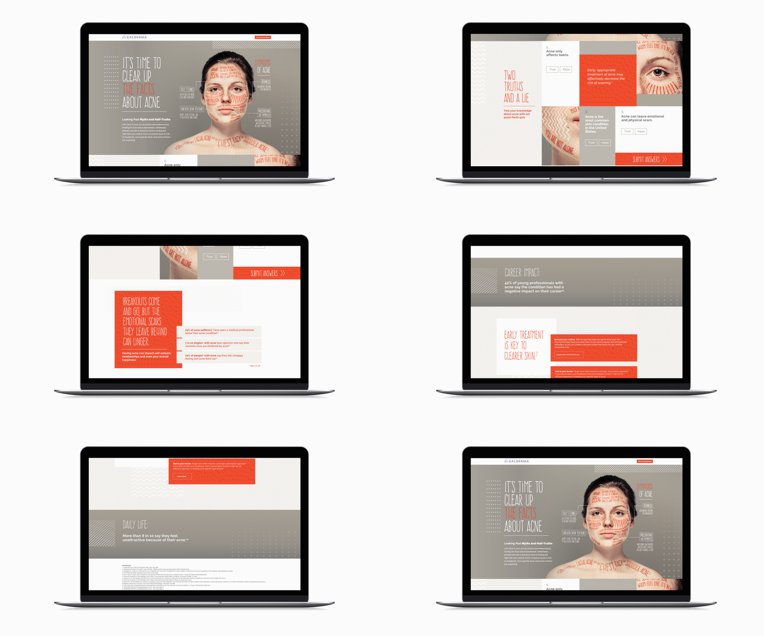
Acne is the most prevalent skin disease in the United States, yet most of us don’t see the struggle that happens beneath the surface. For Acne Awareness month, our client – a major global pharmaceutical manufacturer –  wanted to educate the public and healthcare providers about the unseen emotional realities of acne.

We created an unbranded educational campaign with the goal of combining the data and the human element to show people with acne that they are not alone and empower them through a sense of community. Beyond educating the general public, it was important to connect healthcare providers to the patient experience. By showing them the daily struggles of people with acne, healthcare providers can begin treating acne beyond the surface and focus on healing the individual in full.

The result is a powerful campaign that brings a silent battle to the surface and shows people struggling with acne that they are not isolated with their feelings.

A season of ballet programming is made up of a series of performances, each standing alone as a unique story being told on the stage. How, then, do you create a campaign that communicates these different stories under one cohesive message? That was the obstacle we faced when ideating creative assets for the Texas Ballet Theater’s 2019-2020 season campaign, and here’s how we solved it.

Campaign Goals

  • Tell the individual story of each performance, while also fitting the unique designs into one cohesive, identifiable campaign.
  • Conceptualize ideas that work in photography to incorporate the dancers as crucial campaign assets.
  • Illustrate the ballet’s marriage of art and athleticism.
  • Attract a wider audience and convince them to become season subscribers.

The Challenge

Branding an entire season of ballet was a huge puzzle for us because each performance has its own story to tell, full of imagery and icons that are significant within the individual narrative but may not translate into one clear campaign. Plus, it was crucial for the dancers to be featured in each advertisement, so finding a way to marry all of those elements into a unified campaign was crucial.

We needed to create a full season campaign that is cohesive, blends together as a collective vision and message, but that also has enough individuality for each performance that a creative asset could confidently stand on its own. For that to occur, there needed to be enough interest and variety on a performance level as there was on the campaign level, so that the creative assets could be used in advertising on multiple platforms and mixed media.

The Creative Solution

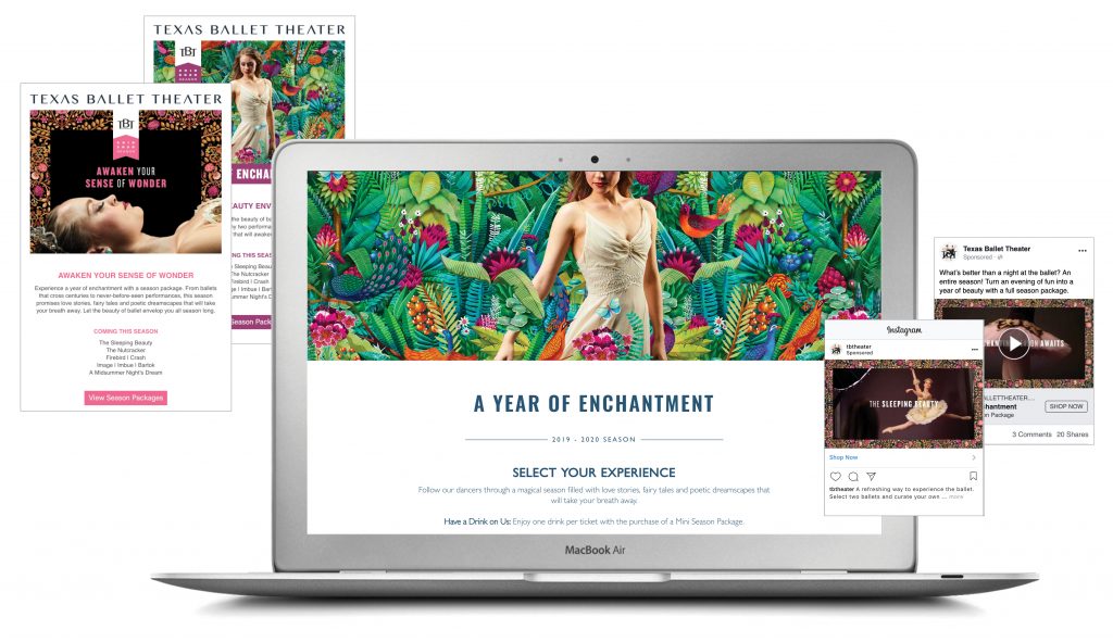
We developed “Alive with Wonder,” a concept featuring the tagline Let Beauty Envelop You. This central message was accomplished by creating illustrations unique to each performance and then having those designs envelop the dancer on the page. Each pattern visually represented individual performances with elements that are important to the story on the stage.

This interaction between dancer and design alluded to the immersive experience of witnessing performances on stage and hammered home the overall campaign tagline – Let Beauty Envelop You.

Once finalized, the campaign imagery was extended into a full graphic system that allowed for both consistency and customization in the promotion of each performance. To accommodate the variety of mediums in our cross-platform media strategy, the flexibility of the system was imperative.

Making Life Better

The common misconception about ballet is that the performances are only suited for fans of high art or those that understand the nuances of performative arts. General audiences sometimes mistakenly assume that a barrier exists between them and enjoying and understanding ballet performances. The reality is this: over the course of a season of ballet programming, a performance will occur that is enjoyable for all types of audiences with different levels of ballet experience. Creating a campaign that cohesively communicated the different themes and tones of each performance and enticed a wider audience to attend was a hugely rewarding endeavor.


National Addy Award Winner


An Award-Winning Campaign

The Texas Ballet Theater’s 2019-2020 season campaign took home some prestigious awards from the American Advertising Federation at the local, regional and national levels. All totaled, the 2019-2020 season campaign won 9 Gold Awards, special Special Judge’s Awards at both the local and regional competitions and a National Silver Addy. It is such an honor to be recognized and earn shared success with our clients.

Most prescription savings cards cover a narrow scope of treatments, which overcomplicates the savings process. As a result, patients are often left confused about how to redeem savings and may end up actually paying more for their prescriptions. Discounts change frequently and branded products are not always covered, leading to patients and providers losing confidence in the cards and programs themselves.

Galderma CareConnect is a patient savings program that consolidates Galderma’s prescriptions into one savings portal that’s accessible for patients and “Remarkably Simple” to use.

Goals:

  • Build awareness of the savings program among qualified patients.
  • Make the program easier to access for patients.
  • Inform more potential patients about their eligibility for the program.

Strategy & Execution

Hahahaha led the Galderma CareConnect launch with a few key strategic imperatives: communicate the scope of Galderma prescriptions covered under the program and quickly build awareness of the program among patients, healthcare providers, and pharmacists. We developed a comprehensive, multi-channel campaign around the tagline “Remarkably Simple.” This included traditional advertising, digital ads, video, paid digital media, display targeting, customized email marketing as well as personal and non-personal sales support.

Connecting Patients with Care

At the core of this comprehensive campaign was GaldermaCC.com, a centralized location for information about the savings program. The site was strategically developed to communicate key information to each of our core audiences:

  • Patients – Information about savings, ease of use and a great opportunity to quickly download a GCC card.
  • Healthcare Professionals – Key points to share with their patients when prescribing Galderma products, information about pharmacy access and a portfolio of products on the card.
  • Pharmacists – Information about patient eligibility.

The website follows a clean design and user-friendly navigation to make the user experience just as “Remarkably Simple” as the Galderma CareConnect program itself. In addition, the website utilizes a seamless API to connect directly with the card provider, so that a unique card can be generated in just seconds when the user chooses to download.

By making this direct connection, we are able to utilize technology and data to measure card redemption rates at pharmacies across the country and measure the success of marketing campaigns in market.

Results

  • In less than two years, Galderma Care Connect site metrics have steadily climbed month after month.
  • To date, Galderma Care Connect has reached more than one million unique patients.
  • As of June 2019, more than 3 million prescriptions have been processed through the Galderma Care Connect portal, saving patients, healthcare providers, and pharmacists valuable time and money.
  • MM&M Gold Award for Best Payer Marketing.

Make Life Better

Navigating healthcare can be a confusing process for patients and even some healthcare providers. By creating the Galderma CareConnect website, we were able to help more people download a patients’ savings card and connect them with more affordable care.

As one of the nation’s largest independent real estate development firms, Hillwood Communities has spent 30 years creating community through master-planned developments. Hillwood Communities continues to raise the bar in terms of quality, innovation, and the unmistakable sense of community that sets each property apart.

So, when Hillwood tasked Hahahaha with creating a new website for their Union Park community, we needed to build a website that communicated the excitement and energy of the community in order to convert visitors into Union Park homeowners.

Goals

  • Educate prospective homeowners about Union Park
  • Improve website functionality to encourage more user interaction
  • Increase qualified lead collection through the website to grow the Union Park marketing database
  • Encourage foot traffic to model homes at Union Park

Strategy & Execution

Our strategic imperative was to evaluate Union Park’s existing website and streamline the information to more accurately represent the community under the tagline “Live a Vibrant Life.”

Our team utilized existing user data from two of Hillwood’s other community websites to craft high-level strategic conclusions that informed how we built the Union Park website. We used sophisticated web tools to identify user engagement patterns through on-site heat mapping, screen recordings, and behavioral pattern flow.

The Union Park website was integrated with home inventory feed to give site visitors real-time information about available homes. We added a testimonial portal that gave prospective homebuyers insight into the active lifestyle and community that powers Union Park. We incorporated a live social feed that gives visitors up-to-date information about what’s happening around Union Park, and we added a Google Maps integration that empowers people to easily find Union Park on desktop or mobile.

Furthermore, we continued to optimize and improve the website based on reporting and detailed analysis. One core improvement that we made was building a chatbot to automate conversations with prospective home buyers, deliver relevant content, and collect qualified leads to pass along to the builders. The chatbot also helps direct users to specific pages of interest to help create a frictionless consumer journey.

Results

We designed the website to have user-friendly functionality that encourages engagement but also helps the consumer effortlessly move through the home-buying journey.

Since the new website launched:

  • Average website session duration has increased by 30%
  • Union Park website form fills have increased by almost 4X
  • PDF downloads have increased by more than 20X
  • Pageviews have increased by 15%
  • High-quality foot traffic has increased to the community.

Make Life Better

Creating communities doesn’t happen overnight – it can take years of strategy and ongoing marketing efforts to cultivate the right audience to buy into a new development and call that space “home.” As a result of creating Union Park’s new website with improved functionality, we were able to connect the community with more qualified leads in a much shorter period of time.

When the Texas Ballet Theater needed a way to reinvigorate their marketing, we created a comprehensive marketing campaign that expanded their ticket sales from a steady group of subscribers into a larger group of new season ticket holders.

The Problem

Season subscriptions to Texas Ballet Theater, while strong, had stagnated. Subscribers were offered the same options year after year, purchase the entire season or purchase single tickets at a later date. Within performing arts, the prospective ticket buyer ranges from the devoted fan to the person that wouldn’t even consider attending. Marketing resources are precious, and we have to ensure they are being invested where they will yield the highest ROI.

The Solution

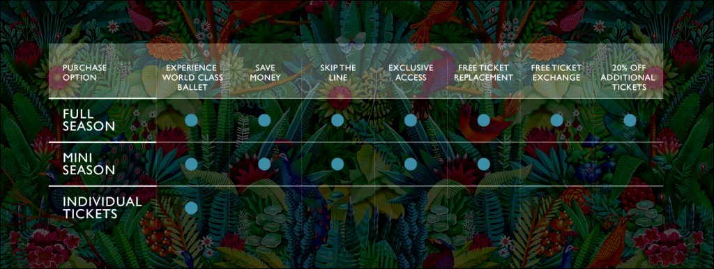
Using data to drive decisions, Hahahaha proposed restructuring subscriber packages to give existing patrons more choice and convince new people to become subscribers and single ticket purchasers. Beyond subscriptions, the campaign was designed to have a positive impact on single ticket purchases. Single ticket sales launched in the middle of the campaign on July 1st, and within the first day, more than 3,500 individual tickets were sold.

The Approach

One of the largest components of our overall campaign was audience segmentation. To accomplish this, we appended audience data from TRG Arts – the Ballet’s consultant.

We divided the Ballet’s existing consumers into four distinct groups of:

1 – previous year subscribers
2 – lapsed subscribers
3 – multi-performance buyers
4 – single ticket buyers


By building package options, we were able to convince larger subsets of people to subscribe to Texas Ballet Theater.

We added historic subscribers and single ticket purchaser data to create persona profiles based on audience demographics and psychographics. We then built lookalike audiences based on the four groups and mapped each of the groups’ behaviors to identify purchasing trends across multiple digital channels. This gave us the insight needed to better understand their consumption habits and likelihood to purchase either a full or partial season or if they were likely to be a single-ticket purchaser.

Once we isolated recurring trends in the audience segments, we hyper-targeted the right ticket package to each group through paid digital media. Further, website retargeting enabled us to identify those that had expressed interest but not yet purchased and then retarget them with the TBT message most likely to yield a purchase.

Goals

  • Clearly brand the full 2019-2020 ballet season, while also promoting individual performances on their own merits.
  • Earn more new, full-season subscribers.
  • Define the main buyer personas and outline their purchase-decision journeys to understand their motivations for purchasing a full-season subscription and a single-performance ticket.
  • Outline a way to recapture people that did not renew their full-season subscriptions from the previous year.

Results

  • Paid media campaign delivered 1.8 million targeted impressions, and generated more than $40,000 in ticketed revenue in just a few weeks.
  • After only 2 weeks of a dedicated full-season campaign, subscription sales up by nearly 3% YOY.
  • New subscribers up by 45% YOY.
  • Exceeded last year’s launch-day single ticket sales by more than 10%.
  • Total ticket sales up 18.43% YOY, despite a later season launch than 2018.
  • During the campaign, overall website sales totaled $199,000.