While the spring break season is consistently successful, Telluride Ski and Golf Resort needed ways to entice travelers to visit during off periods leading up to peak season. To do so, they developed a discounted lift ticket and partnered with Hahahaha and local retail locations to get the word out. While similar campaigns had experienced previous success in markets within driving distance to the resort, Dallas Fort Worth, a flight-first market, needed a unique strategy and market push to get in front of the right audience and convince them to convert.
A Nimble, Focused Strategic Partnership
With spring break rapidly approaching, we moved quickly and efficiently to launch the campaign in market at the optimal time. Our team offered strategic direction to their in-house creative team to be most cost-effective and focus our efforts on media strategy and getting into market in a very quick time frame. Telluride offered the discounted tickets through ski shops throughout DFW, so our digital strategy focused on driving foot traffic into the retail stores to ultimately sell the lift tickets.
Creating a Digital Strategy Aimed at In-Person Conversions
Because there was no online portal for selling discounted lift tickets, our campaign focused on building awareness and driving audiences to local ski shop partners to purchase tickets. With minimal time available before launch, our team created a streamlined media strategy that pushed audiences to a landing page where they could learn more about the retailers offering discounted ski lift tickets. The strategy incorporated paid social and display ads targeted through strategic geofencing, contextual targeting and retargeting with content related to skiing, outdoors and travel. We determined that tourists are the primary market interested in and available to book last minute trips, and targeted users that had a propensity to travel and an interest in skiing and resorts. Ultimately, our team created an effective digital strategy that engaged leads and moved them to brick-and-mortar retailers to purchase their tickets.
Results:
Campaigns contributed to 181 total passes sold in-store and over $85,000 in total revenue for an overall ROI of 13:1.
Sold 181 tickets in 14 days.
Telluride sold 4X the number of ticket sales during our campaign compared to the previous period.
The Telluride “5 Day Special” landing page received over 6.9K pageviews over the course of the campaign.
Almost 11% of landing sessions were “engaged sessions” (691), where users spent more time on the page or bought tickets.
Golf is a timeless sport that brings people together to enjoy camaraderie and pristine, cultivated greens. But, what happens when you add luxury travel and experiences into a premium golf membership? You get Icon Golf – an esteemed golf and travel membership that takes players around the world. Icon needed to revamp their brand to generate more memberships, so they partnered with the Hahahaha team to refocus their sales efforts with a full-scale, multichannel digital campaign and a new website.
In 2020, Icon invested in increasing their sales from 250 memberships to 1000. So, they partnered with Hahahaha to revamp their brand, generate more memberships, and focus their sales efforts with a full-scale, multichannel digital campaign and a new website to meet their very aggressive goal.
Goals
Grow Icon Golf membership database from 250 to 1,000 in 18 months.
Refresh the brand identity
Develop a content marketing strategy
Build a CRM to streamline lead generation and membership management
Improve online user experience
Prioritize sales efforts
Roles
Strategy
Creative
Digital
Branding
Positioning
Client Services
Partnering to Develop a Structured, Integrated Sales Process
We began our relationship with Icon Golf on the ground level as they were initiating the formal development of a structured sales team. This allowed Hahahaha to partner directly with the Icon team to merge sales and marketing efforts. Icon’s previous marketing efforts were primarily functioning by word-of-mouth and leveraging connections with existing club members within their portfolio. While this approach was successful, there was an opportunity to expand their sales efforts through digital automation to reach a wider audience.
We started by evaluating each medium against our overall goals and the need to fill the funnel with awareness initiatives and convert interested prospects into members. We found that paid search and streaming audio and video proved successful for building awareness, and third party publication emails allowed us to hit a very targeted audience that was ready to convert.
A Refreshed Creative Platform
We recognized an opportunity to reinvigorate their creative platform to better communicate the unique benefits that an Icon membership provides. Icon Golf offers members full privileges with an expertly curated collection of private golf clubs as well as luxurious member experiences and fully planned quests to exotic locales. So, Icon Golf is much more than a golf membership – it’s a full-package of golf and travel – and communicating that was the central challenge of updating their creative.
When creating the updated creative platform, we focused on the luxury aesthetic and benefits of an Icon Golf membership. We wanted the design and language to reflect the elevated perks and nature of the membership, all while highlighting the relationship-focused aspect of joining Icon Golf. The camaraderie between Icon members is a key strategic imperative, so we had to make that central in the updated creative deck.
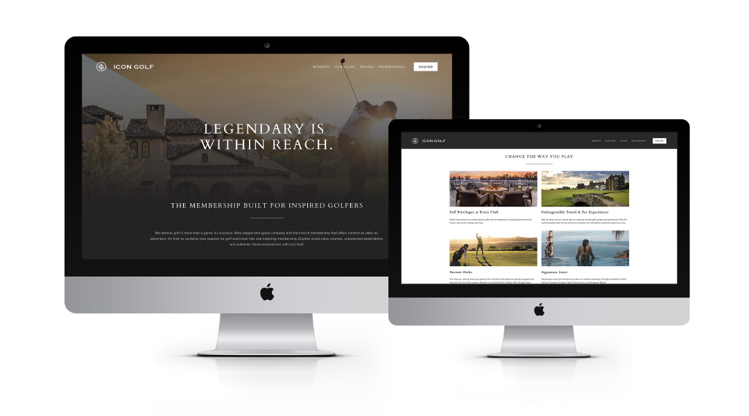
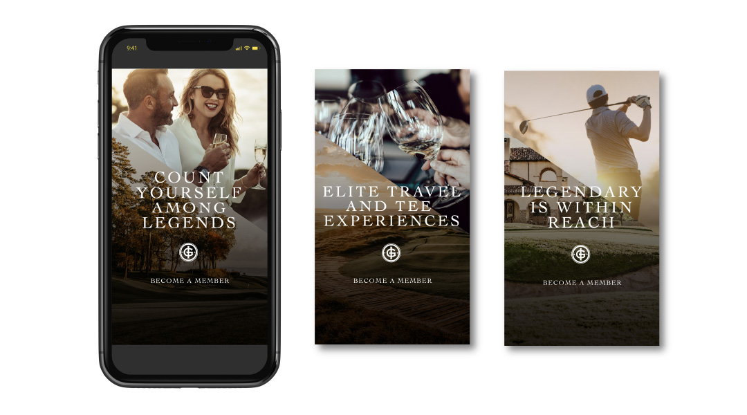
We created the concept “Legendary is Within Reach” as our primary branded language alluding to the potential for legendary moments with legendary people, on and off the course.
A New, Optimized Website
The central piece of Icon’s rebrand was optimizing their website to generate more qualified leads. Previous to our relationship,the Icon Golf website was split into two different URLs – Icon.Golf and IconGolf.com to satisfy internal marketing objectives. However, this split up their traffic and made consolidating valuable lead information more difficult. So, we combined their properties into one streamlined website. To increase the site’s performance, we implemented key SEO and content updates targeted at their primary audiences.
Our team also redeveloped the site with crucial user experience updates to improve site accessibility and usability aimed at generating form fills from qualified leads. To improve usability, we simply added header and footer navigations to improve the overall user experience. In addition, we employed site tagging to capture key user behavior metrics in order to continue to drive future data-driven site optimization opportunities. Finally, we placed CTAs throughout prominent areas of the website so that users could always and easily make direct contact with the reps at Icon Golf. The final result is a website that supports Icon’s strategic marketing goals by generating more engagement and qualified leads.
Creating a Centralized Lead Strategy
To continue to round out the lead generation strategy, we implemented a CRM strategy to accurately target lists of valuable, interested leads with compelling emails. We connected key data sources – the Icon website, MailChimp, and Salesforce as well as other lead collection points to ensure that our data automatically fed into the sales process and reduced the work the sales team needed to do to generate more memberships.
We created a variety of emails around the central message “Legendary is Within Reach” that ultimately guided leads to complete a form fill and capture valuable data for converting more leads.
To round out the digital strategy for Icon, we created a multi-channel paid media strategy that targeted valuable audiences in paid search, paid social media, display banners and email. In addition, we cultivated strategic partnerships with golf publications and outlets to secure high-value placements in front of the most highly qualified audience.
Results
In 2021, Icon Golf had their best year ever, setting a record month for membership sales in December.
Reached 85% of their new membership goal in under 9 months
Last Click Attribution:
31 new memberships driven directly by campaign paid media
$450k in revenue
Total annual revenue surpassed 1.7 Million, resulting in a strong ROAS of 7:1
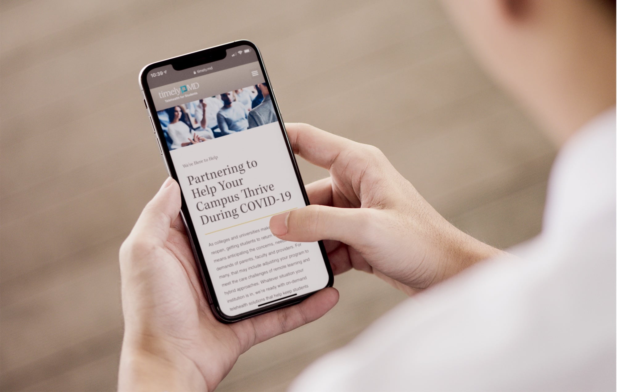
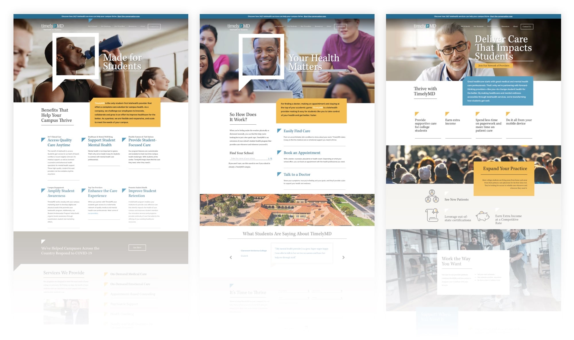
Our client TimelyMD approached Hahahaha needing a new website that would help sell their telehealth services. After beginning the project, we discovered an opportunity to refine their market position to thrive and earn unimaginable results.
Goals:
Create a website with a modern look that performed better to aid in the sales process
Demonstrate to higher-ed clients how TimelyMD can aid in student retention
Appeal to decision-makers in higher education and attract students and providers
Taking a Clear Stance in Remote Healthcare
In the world of remote healthcare, most brands take a broad approach and treat general audiences. To help TimelyMD rise above their competition, we sought to differentiate the brand from the rest of their competitors. After intense discovery and research with the client, we discovered that no brand in the remote healthcare space is focused on treating the entire student – mentally and physically. TimelyMD offers mental healthcare in addition to their primary healthcare services, whereas most remote healthcare companies don’t provide comprehensive care that covers overall health.
To reinforce their commitment to student-focused telehealth, TimelyMD partnered with colleges and universities and worked with them on how best to serve their students during the Covid-19 pandemic. This willingness to partner with colleges and universities has been critical to their recent surge in growth and success and represents yet another key brand differentiator for TimelyMD.
Communicating a Focused Position
A refined position is only as good as the messaging that communicates it to the world. To illustrate the benefits of TimelyMD, we sought to amplify the brand name and their goal of supporting the health and wellness of students so they can focus on what matters—thriving.
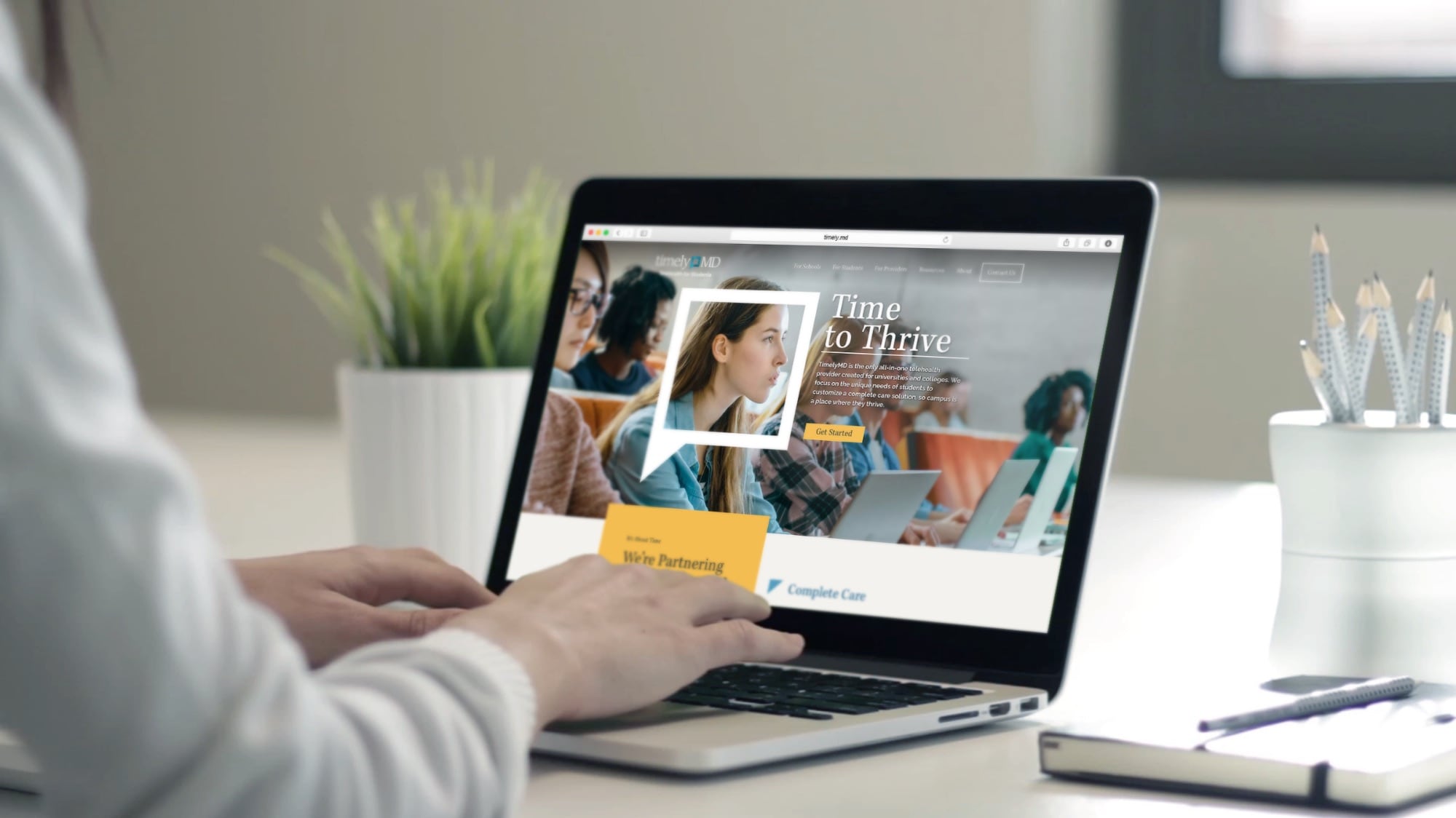
Ultimately, we decided to pursue the concept “Time to Thrive” to demonstrate that TimelyMD helps students thrive in their physical and mental health while they’re at school. This represents a stark shift in the generic telehealth space, where most brands are marketing images of sickly students looking at their phones rather than enjoying their health. We wanted to reinforce that TimelyMD’s care leads to happier, healthier students, which creates thriving colleges and universities.
Building a Functional Multipurpose Platform
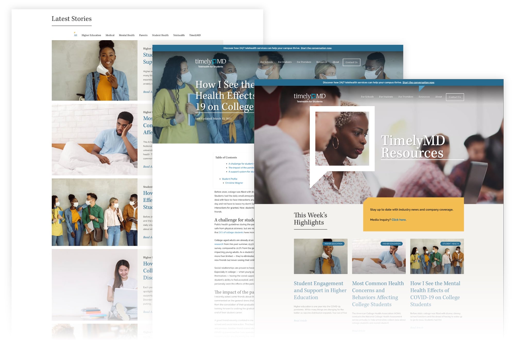
We began this project with the goal of building a functional website that performed better with an improved look and user experience. Before diving into web design, we sought first to understand who the primary audiences were and how they would use the site. Our research revealed that the primary users were school administrators, decision-makers, medical officers, and students. Each uses the TimelyMD site differently, so we had to balance their unique user experiences in the new website to satisfy strategic objectives for each. We designed different pages for each of the specific audiences that use the TimelyMD website to better connect with those users and satisfy their queries.
To improve the site’s functionality and user experience, we simplified the navigation and created more calls-to-action and displayed them prominently on each page. The simplified navigation and clear CTAs help focus the user’s journey into a desired action and made contacting the staff at TimelyMD far simpler. We also introduced better filtering capabilities to make it easier for any user to find the information they need more effectively. The final result is a website that is easy to navigate for different users and one that is more effective at delivering the right content and connecting users to the staff at TimelyMD.
Results
Created a new website
Created new messaging
Guided the client to successful, student-facing digital targeting
Established visual style
Organized their site so three distinct audiences could navigate with ease
Marketing in-person events comes with its own set of challenges, but after the pandemic struck, we were presented with a new range of obstacles to activate the community and generate awareness, excitement, and attendance. For the Kimbell Art Museum, we were tasked with creating a community activation campaign that highlighted Queen Nefertari’s Egypt exhibition and encouraged people to safely enjoy the exhibition in person.
Goals
Create community activation and engagement
Connect the exhibition to people and encourage them to enjoy it in person
Encourage community awareness of the new exhibition
Utilize social media to educate the public and generate buzz for the exhibition
Encouraging Engagement During Uncertain Times
Getting in front of your audience physically during the pandemic can be challenging, but there are creative ways to target and engage the community in the digital space that still leads to conversions. The Kimbell needed a big idea that could break the mold of traditional marketing, and we were up for the challenge!
Instead of relying on traditional marketing methods to encourage in-person attendance, we specifically utilized the digital space to accomplish this, examining new trends, tools, and opportunities to engage our audience virtually. While digital analytics are incredibly valuable, this presented another challenge because the ultimate measurement of success is in-person attendance.
Pivoting for Success
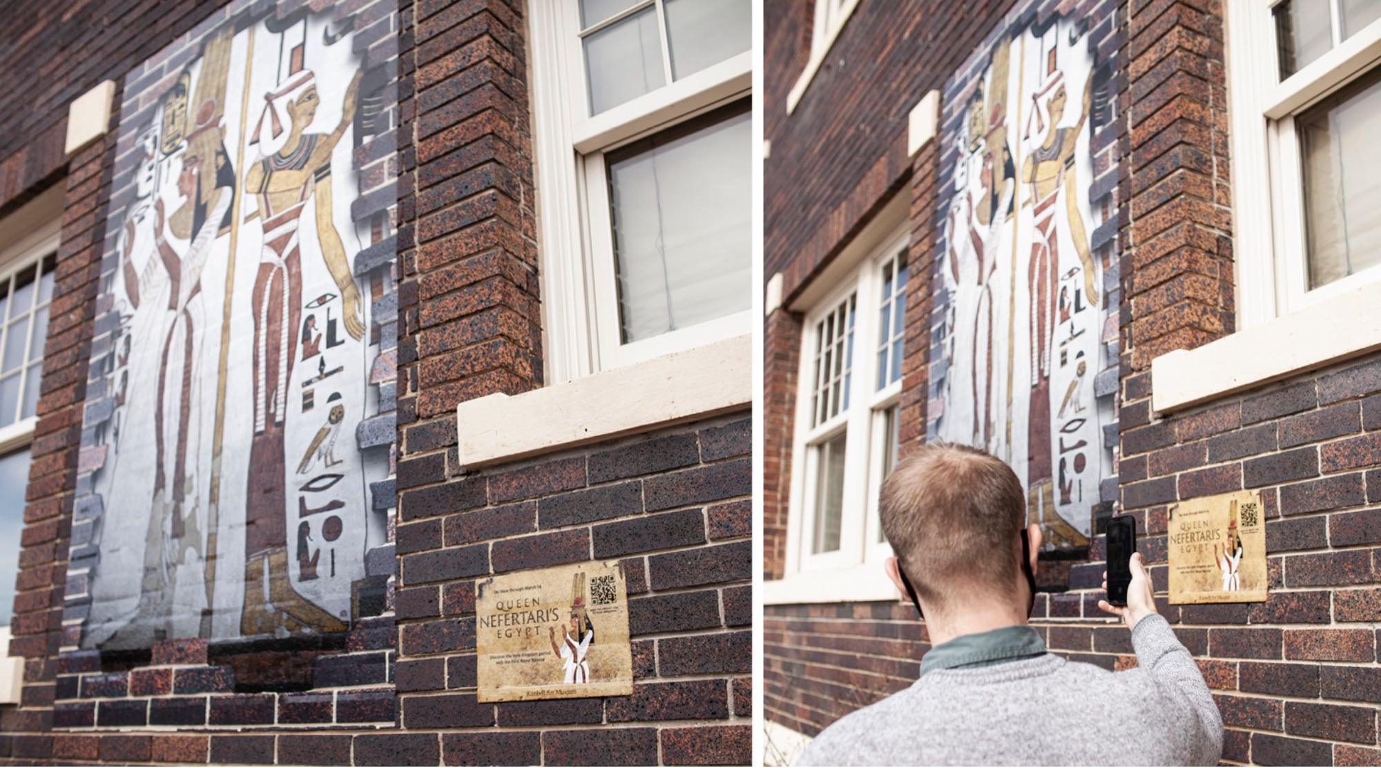
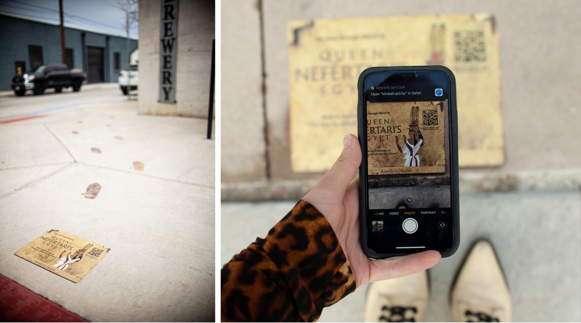
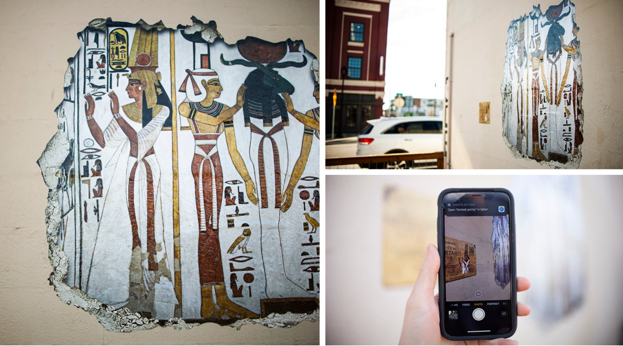
Rather than presenting a hard push to get people to the Nefertari exhibition in person, we decided to bring the exhibition experience to the community in a safe way. We created a series of outdoor installations that teased the exhibition and activated audiences in the safety of outdoor spaces. Our team created 3 different murals and 8 different ground clings that educated people about the Nefertari exhibition and encouraged them to experience it in person. For placement, we leveraged internal relationships to strategically set the murals and ground clings in areas that have high foot traffic and chose locations to help build the Kimbell’s network and local footprint. These installations allowed our audience the chance to walk in Queen Nefertari’s sandals and experience the magic of uncovering a hidden Egyptian ruin.
Leveraging a New Technology
To supplement the installations and ground clings, we sought a way to digitally engage our audience wherever they are and immerse them in Queen Nefertari’s Egypt. We worked with the Kimbell to come up with an engaging digital campaign to shift into the digital space. This was a big step for the Kimbell, since most of their previous campaign activations were created with traditional advertising methods. After careful market observation and extensive digital discovery, we found that more and more destination brands were incorporating augmented reality into their marketing plans.
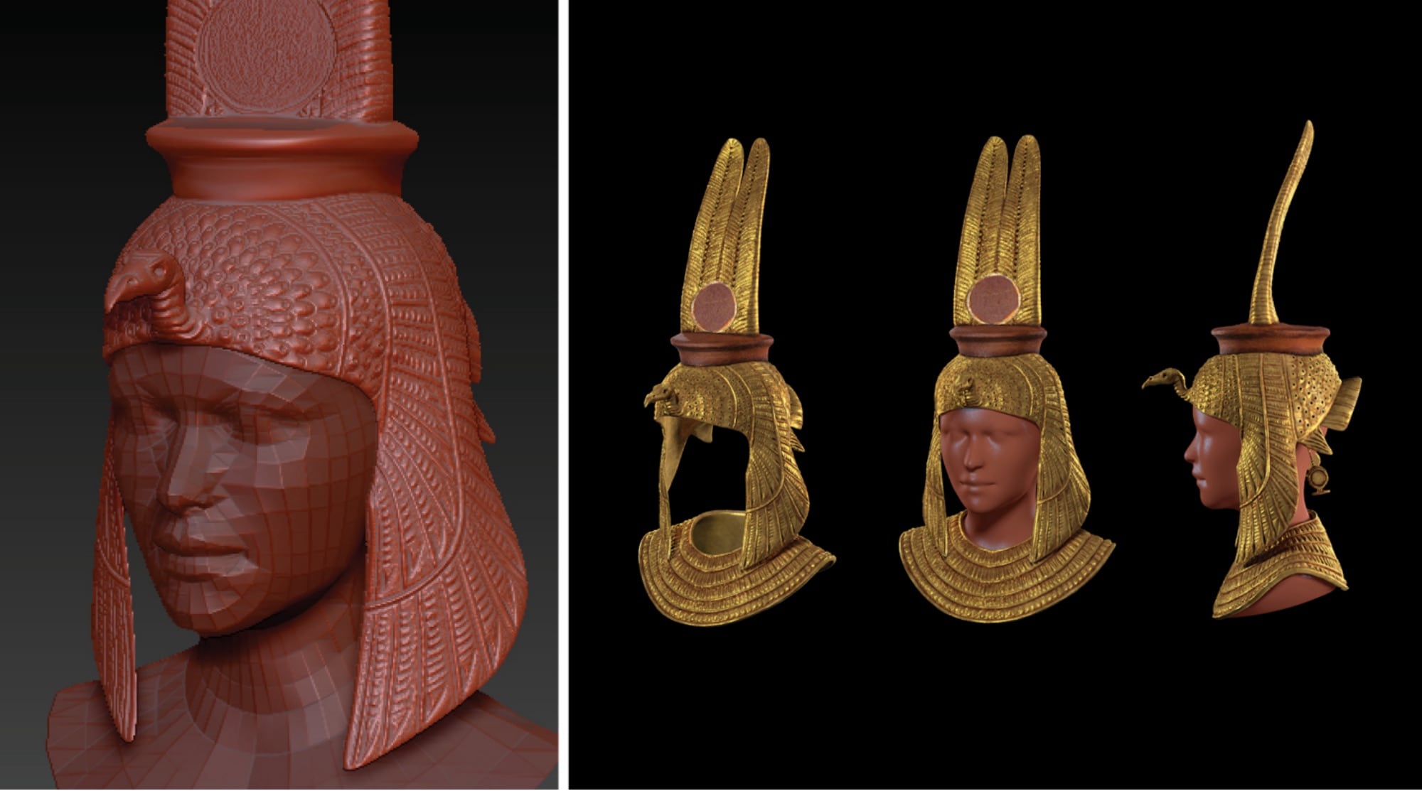
Augmented reality takes many forms, but at the core of AR is the ability to partially immerse a user in an experience through a digital device like a phone or computer. For the Kimbell, we sought to create an AR campaign that brought Queen Nefertari to life and offered our audience a new way to engage with the exhibition. We created two AR filters that gave people two distinct ways to place them in Queen Nefertari’s Egypt.
The first AR filter we created features Queen Nefertari’s crown – a three-dimensional depiction of a flat hieroglyphic crown that people could wear and enjoy on Instagram and Facebook. The second AR filter features a series of hieroglyphs etched into stone laid behind the user to make it appear as if they had just discovered the ruins.
It was a challenge to take a flat hieroglyphic crown and turn it into an accurate three-dimensional rendering. But, after hours of research, testing, and iteration, we were able to take a piece of Art and turn it into a relatable and engaging piece of technology that was accessible and relevant to audiences everywhere.
Results
Helped the Kimbell effectively reach max capacity of the Nefertari exhibition
More than 1.1M paid media impressions
More than 5 thousand tickets sold
The entire campaign resulted in more than $383k in revenue
AR filter earned 5.7K impressions and 3.6K opens
CTR of 1.71%, above the industry standard of .8%
308 shares of the filter ads
Incorporated new technology into our client’s marketing strategy
Produced and installed wall murals and ground clings
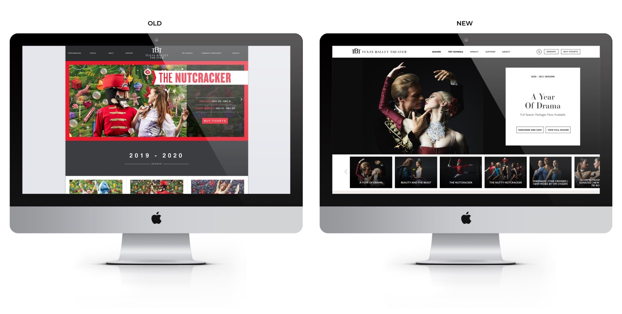
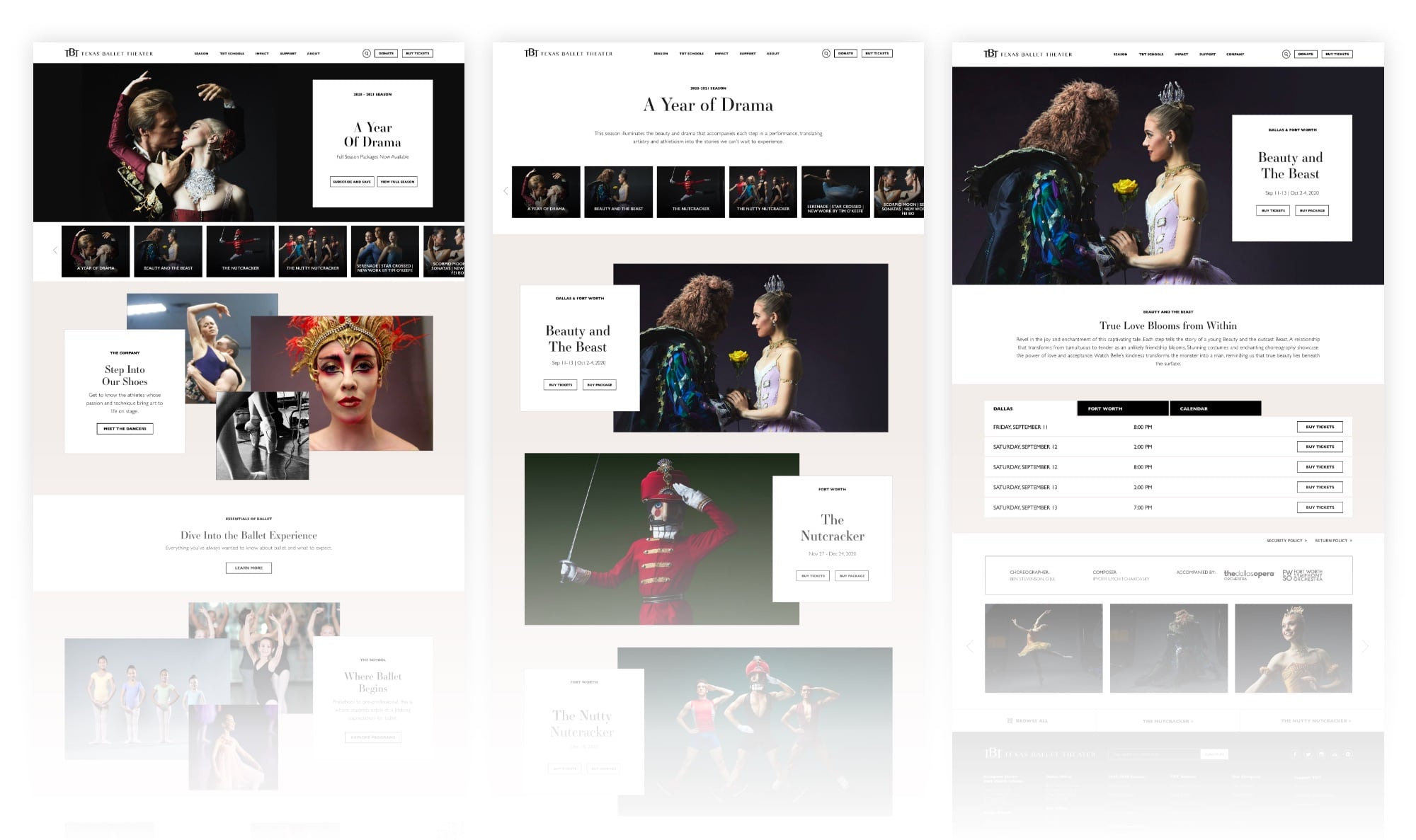
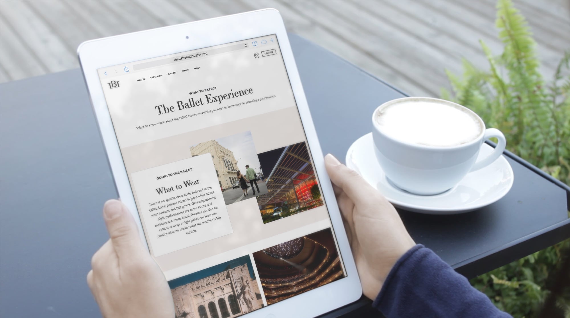
Building a website is an opportunity to hone in on specific marketing objectives and create a powerful digital space to engage consumers. We partnered with the Texas Ballet Theater to build a website focused on improving ticket sales through an improved user experience, and design it to share the exuberant spirit and artistry of ballet in its structure.
Goals
Develop a new website, and shift the focus to ticket sales
Develop content specifically to help visitors relate to the professional dancers
Highlight the ballet company and their role in the community
Create a website that is easy for the organization to update and change season to season through use of internal marketing resources
Defining a Clearer User Journey
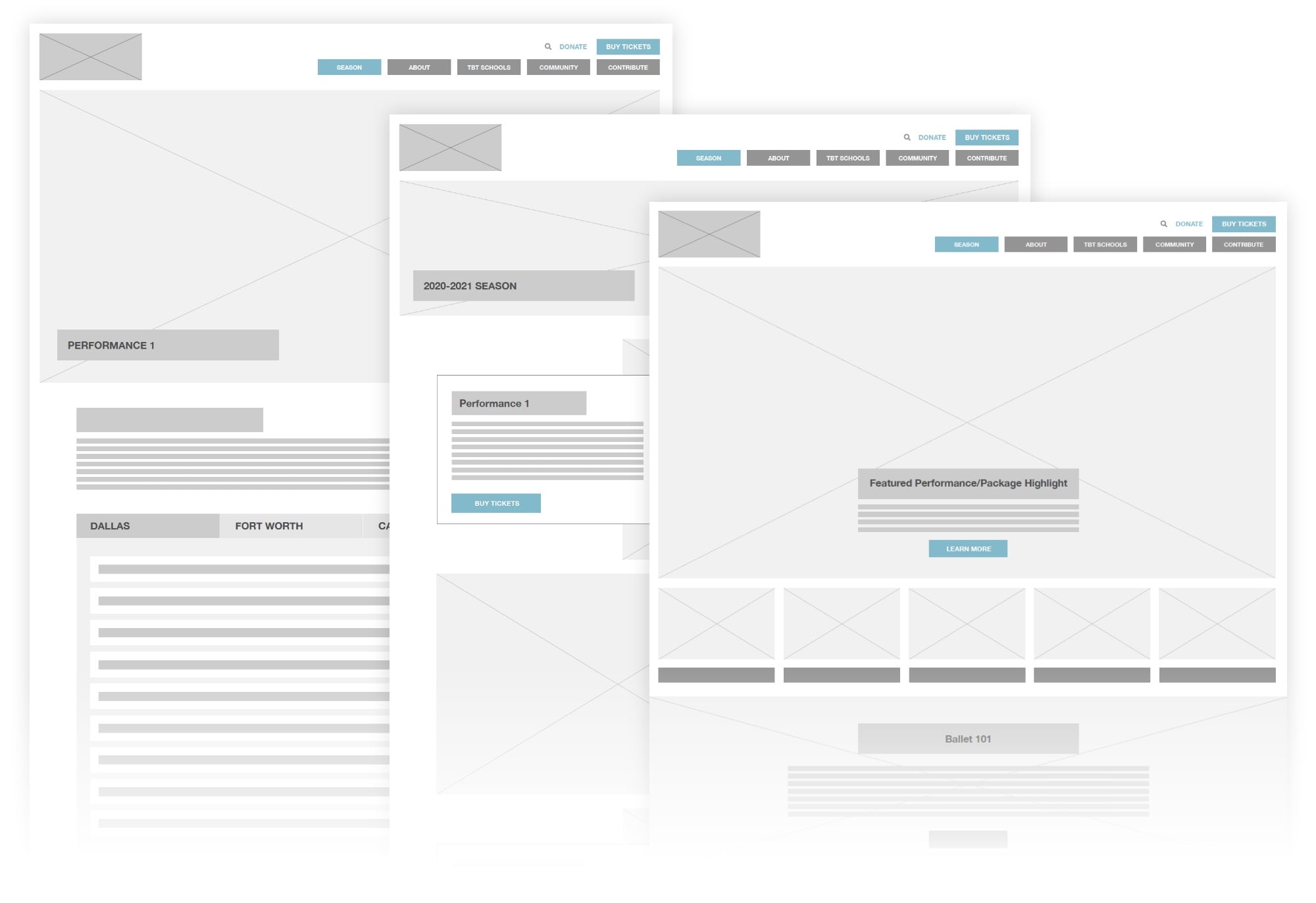
When building a new website, understanding how people use it is key to pair functionality with supporting key marketing objectives. For Texas Ballet Theater, we took a deep dive into the popular user paths people take to purchase tickets and sought to understand the user experience. One critical point that we discovered was that there were far too many clicks and exit points between users and purchasing tickets. With that in mind, we defined clearer user paths and designed the structure of the new site to make it easier and quicker for users to purchase tickets.
Strategic Content Migration
As we shifted the new website to focus on e-commerce, we reduced the number of actions it takes to purchase a ticket down to two simple clicks and made the ticket sales portal readily available and visible on each page. To minimize the bounce rate and encourage more time on site, we improved the user flow by reducing duplicate pages and dead ends on the site. We also instituted analytics to track revenue data and connect e-commerce data to the ticketing system to monitor our progress.
The result of the strategic content migration is a streamlined site that is focused on guiding users to purchase tickets and learn more about the Texas Ballet Theater.
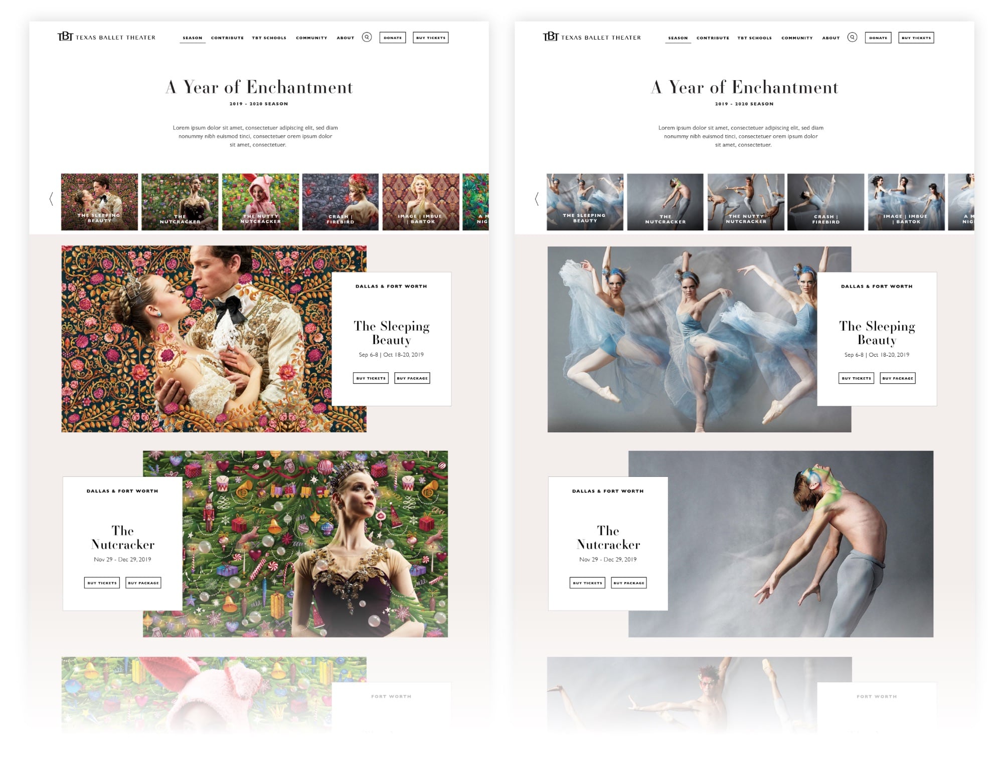
Site Architecture Aimed at e-Commerce
Through discovery and internal research we determined the key objectives were to restructure the site navigation to improve ticket sales, but also educate the public about Texas Ballet Theater beyond their on-stage product. The website needed to promote special events, highlight donation opportunities, and showcase the work that TBT is doing for local schools and young dancer education, as well as their many community outreach initiatives. So, we consolidated the number of pages to make it easier for users to navigate from the homepage to any section they needed and reduced the friction in navigating between pages outside of the homepage.
We carefully considered the different types of people visiting the website and used those personas to help create smoother user paths and a richer user experience for a wider audience.
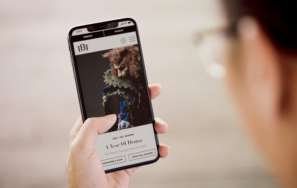
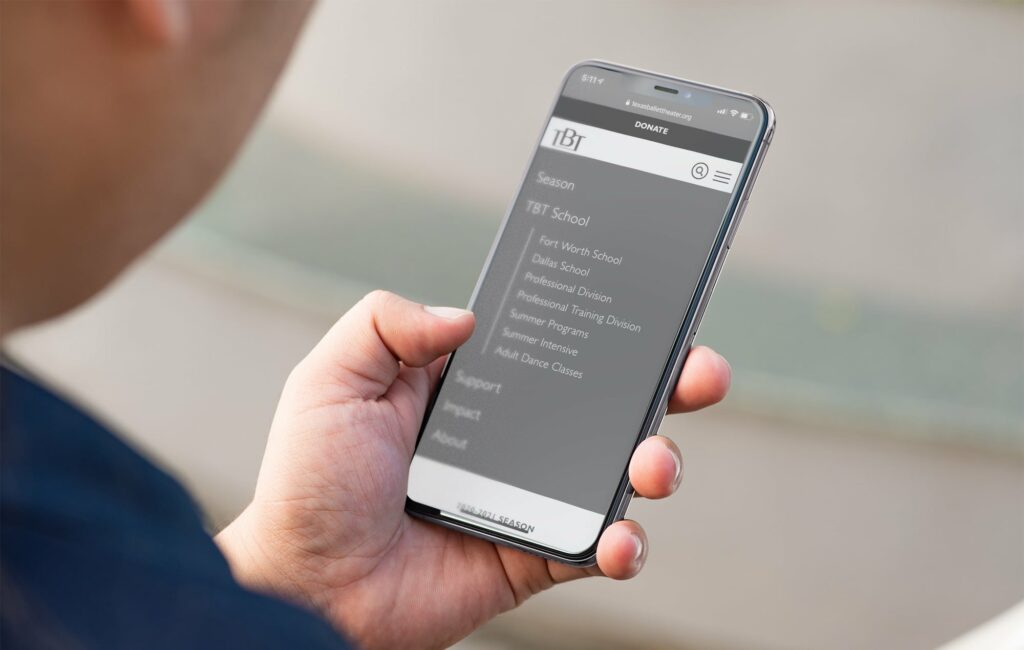
An Improved Mobile Experience
As with any website redesign, a website needs to offer a seamless experience on desktop and mobile devices. When we designed the mobile site, we wanted to ensure that it served the same primary goal as the desktop version: sell tickets. So, we simplified the website to offer users the primary information through shorter users paths. We also improved the navigational elements to make the site easier to click through on mobile devices.
A Website that Communicates the Energy of Ballet
Our team sought to emphasize the spirit of the TBT brand in the final website design so that it was as beautiful as it was functional. Furthermore, we wanted to elevate the performances and dancers so that they took center stage as the visual standouts. We also sought to create a flexible framework for the web design so that each season of ballet felt fresh and exciting without having to undergo significant site construction to update it. The site can easily be updated by the TBT marketing staff, and it’s flexibility allowed for quicker performance updates during the pandemic.
Visually, the new website is driven by photography and highlighting the dancers. We elevated the typography choices and color palette to reflect the modern aspects of TBT so that the pages moved beyond the season and established TBT’s brand. To communicate the dynamic movement and energy of ballet, we used a non-traditional structure that fluidly moves users down the page. The final website design is one that balances form and function while standing as a testament to the fundamental motion of ballet.
Results
The total volume of site traffic was impacted heavily in 2020 as a result of COVID-19, which also led to multiple performance cancellations. However, 2020 metrics still indicate significant increases in overall website performance.
More users clicked to purchase tickets to The Nutcracker 2020 compared to The Nutcracker 2019.
In December 2020, more than double the number of users clicked from The Nutcracker 2020 page to purchase tickets compared to the same page in December 2019.
Behavior flow to purchase tickets improved, with users entering the ticketing platform within just 2 clicks, as compared to 3+ clicks on the previous site.
Improved time efficiencies for updating the website, saving on future and ongoing web development
Incorporated pages where TBT can share about their artistic direction, where they’re going as a company, add their personality
The changing global landscape is driving more and more patients to seek options for remote care. For Epiduo® Forte Gel, the changing healthcare environment opened up an opportunity to create a compelling, digital way for them to understand their acne treatment options. In order to strategically position Epiduo Forte Gel ahead of its competitors, a chatbot was implemented on the brand’s website that encourages patient engagement and prescription adherence through medically and legally compliant content.
Goals
Motivate patients to ask their doctor for a first-time Epiduo Forte Gelprescription
Encourage prescription adherence
Cultivate increased web audience engagement with the target audience: teens that suffer from acne
Differentiate Epiduo Forte Gel in the competitive acne market
Chatbots in Healthcare
Chatbots present an excellent opportunity for healthcare brands to maintain healthy communication with patients. Market-wide, there are just over 1 billion searches for health information performed on Google daily, and 20 million patient and HCP digital conversation sessions per day, according to Google Health. Put simply, there is a growing market to provide patients a digital avenue for quick text conversations to understand vital information about their options. Furthermore, chatbots allow patients to quickly get the information they need and greatly reduces the time needed for a human to handle any given query, saving countless hours and thousands of dollars year over year.
Our Role
Beyond implementing the new chatbot, we also provide ongoing chatbot metrics (or measurement) to gain better patient insights that help us better communicate with patients. By monitoring chatbot engagement, we are able to personalize the patient experience, improve the conversation streams and identify more opportunities to increase patient engagement.
The Conversation Tree of Conversion
When we began developing the Epiduo Forte Gel chatbot, we knew that it had to maintain compliance before it would ever get off the ground. So, we partnered with Conversation Health, a conversational AI platform that is purpose-built for the life sciences industry and sets the standard in terms of accuracy and compliance with medically-trained taxonomies, data sets, NLP and technical stack. Together, we worked to create a button-driven chatbot that adhered to appropriate parameters, a challenge many free text-based bots face when it’s time for legal/compliance review.
We designed the in-bot conversation around two key paths of the prospect funnel. At the top, general acne education and awareness. At the bottom, Epiduo Forte Gel education and follow-up consultation with a healthcare provider. This allowed us to gently move a prospect down the funnel from awareness to action regardless of their stage in the lead nurturing process.
Results
5,000+ engagements in Q4
More than 1,100+ unique sessions in Q4
A majority of users opted in to provide feedback via a survey following bot usage
Most users rated the app usefulness as 5 out of 5
More than 72% of users indicated they would speak with their doctor about Epiduo Forte Gel
Looking Ahead
Chatbots are here to stay – in healthcare, entertainment and countless other industries. As utilization continues to grow, they will play a vital role in lead generation. This mechanism will also facilitate important doctor-patient conversations and shift valuable time that would otherwise be spent in patient care. The Epiduo Forte Gel chatbot continues to engage more patients with acne education and encourages prescription compliance and adherence every single day.
When it comes to oncology, medicine has advanced in big ways. But the business side of running an oncology practice hasn’t kept up. In the age of automation, back-office operations are often tedious, siloed and completed manually. Factors that contribute to misused resources and the growing cost of cancer care. That’s where AC3 comes in.
AC3 is a practice intelligence platform that harnesses the power of data to improve the quality and speed of back-office work. Allowing doctors and staff to trade paperwork and process for a more meaningful purpose—caring for patients. With care being core to their business, the real obstacle was creating an identity that lived up to AC3’s cutting-edge capabilities as well as their impact on patient care.
Bringing Care Into Focus
Cancer is humbling and, most importantly, human. So the branding had to communicate the function of a tech-driven product in a very human way. In addition to a visual identity, AC3 needed a way to talk about themselves to a more public audience. We developed positioning that helped define who they are. And rooted it in the real-world, analog benefits doctors and patients experience. Productivity, revenue, quality of care, this platform gives doctors the ability to do more. A lot more.
For the mark, we took a nod from the company’s namesake—Advanced Cancer Care Centers—and aligned it with the platform’s ability to improve operations within a practice exponentially. We let positioning guide design and the result was meaningful.
With any tech-based product, there’s a concern around sharing proprietary imagery—a challenge we faced when representing the product in a tangible way. Rather than showing the software itself, we focused on the moments AC3 makes possible.
When we took ownership of Lilyana marketing, the community needed a brand that better connected homebuyers to the true joys of living in this community.
Honing in on Key Differentiators
This community is far from cookie-cutter, so it only made sense to highlight the factors that make it stand out in a cluttered and crowded market. For Lilyana, it’s the conveniences and lifestyle that make it a truly special place to call home. With more than 50-acres of green space, the community is packed with natural amenities, numerous parks and things for homeowners to do outdoors. All of which keep the community and people connected.
A Refocused Brand Position
Lilyana is located in Celina, a peaceful, up-and-coming town remote enough to harbor tranquility and close enough to Frisco to take advantage of its entertainment, energy and everything it has to offer. When we began to evolve the brand position, we pulled the thread of accessible tranquility to show prospective homebuyers that it is possible to have it all when you live at Lilyana.
Communicating Joy and Tranquility
We needed a way to portray the very real, and often intangible, qualities that make this community so special. By incorporating bubbles as a visual element, we were able to communicate the true value of a Hillwood community—connection, comfort and an ethos rooted in community. All while positioning Lilyana as a place to pause and enjoy the moment.
In addition to visually refreshing the brand, we also revitalized the brand language to communicate joy in the Lilyana lifestyle. “A place to embrace life’s moments” communicates that Lilyana is a community for people to slow down and enjoy their lives – right here, right now.
Building a comprehensive brand story gives real estate brands more space to have meaningful conversations with home buyers. Developing Lilyana’s position in a cluttered and competitive space helped the brand stand out, and ultimately led to more home sales.
Surgeons have many procedural options when caring for patients, and treating glaucoma is no different. Despite the numerous procedures and tools available for ophthalmologists, they each have the same goal: to treat their patients most effectively.
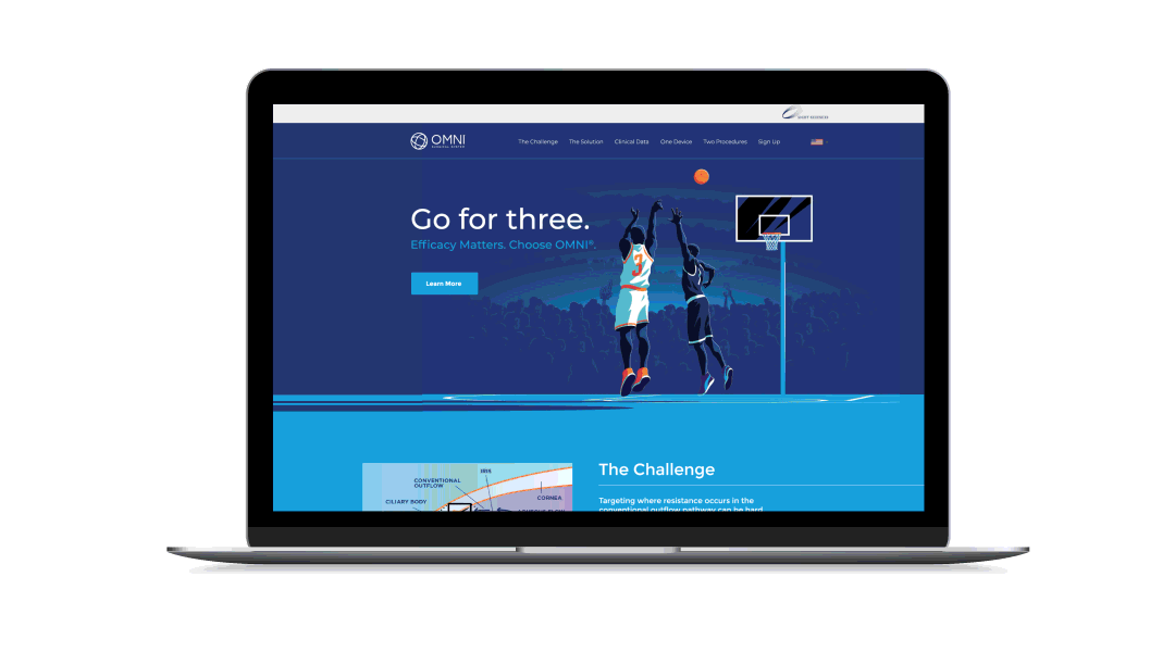
So, when OMNI® launched their new 2.0 device, which has functional advantages over other similar products on the market, we had to communicate the benefits this new device had over its competition.
An Evolved Device Needs an Evolved Campaign
Efficacy is what uniquely sets OMNI apart from other glaucoma treatment options available to surgeons. Beyond efficacy, the new OMNI device provides patients with a more acceptable risk level, addressing all three points of the conventional outflow pathway. While other procedures and devices focus treatment on a single point of resistance. The OMNI Surgical System allows surgeons to treat all severities of open-angle glaucoma, empowers them to intervene in combination and standalone procedures, and provides surgeons with the ability to treat glaucoma with versatility. All of these product advancements ultimately empower surgeons to treat their patients with a more efficacious approach with confidence and provide patients with a higher level of ocular treatment.
It’s All About Efficacy
OMNI’s brand awareness is strong and based on a functional message that resonates with ophthalmologists, cataract surgeons and glaucoma specialists. But we needed to evolve their position from function, that was established during the first generation of the device, and move into a more benefit-driven message that emotionally connects surgeons to their patients. To achieve that, efficacy had to be brought to the front and center of the campaign messaging. Additionally, we had to communicate that no other device addresses all three points of resistance in the conventional outflow pathway.
The concept, “Go for Three,” alludes to taking a three-point shot in basketball. It puts the ball in the hand of the surgeon and empowers them to make the choice. This tagline nods to the new OMNI device being the highest-scoring option available on the market, and encourages surgeons to choose the option that is better than the rest. Why settle for a 2-point layup when you have a wide-open shot at a 3-pointer? This active metaphor was a way to invigorate and engage the target audience with something unique in a crowded device market and simply position OMNI as a shot worth taking.
Results
Reached an all-time high in sales
Accelerated the brand in a very successful direction
Made a huge splash in the industry, even amid the Covid-19 pandemic
Evolved campaign expanded into a sales aid, educational materials, website, and into more multi-media placements
Places are defined by people, and the Near Southside is among the most vibrant and diverse communities in Fort Worth. So, when they approached Hahahaha to help them rebrand their identity, we focused on the neighborhood they create and the people and ideas the Near Southside attracts.
We wanted to present that the Near Southside is first and foremost a community where people and business can thrive in an inclusive and supportive environment. The result is a design balanced in minimalism and boldness that allows the artistic soul of the Near Southside to come through, but also be functional enough to carry the brand across everything from way-finding signage to social. The new color pallet represents the diverse voices that stand up for and continue to create opportunities that cultivate community. The updated identity is malleable enough to work across mediums but enduring enough to be used over decades to come.
It is a pleasure to partner with local organizations that build up our community and help them identify their message and purpose, and carry that through to representing their brand. By creating a flexible mark that more accurately represents the community and culture of the Near Southside, we’re hopeful that their message will resonate more deeply with future community members and contributors. The Near Southside is an excellent ambassador and cultivator of the arts and culture that permeate our neighborhood and creating something that elicits that same level of passion is why we come to work every single day.