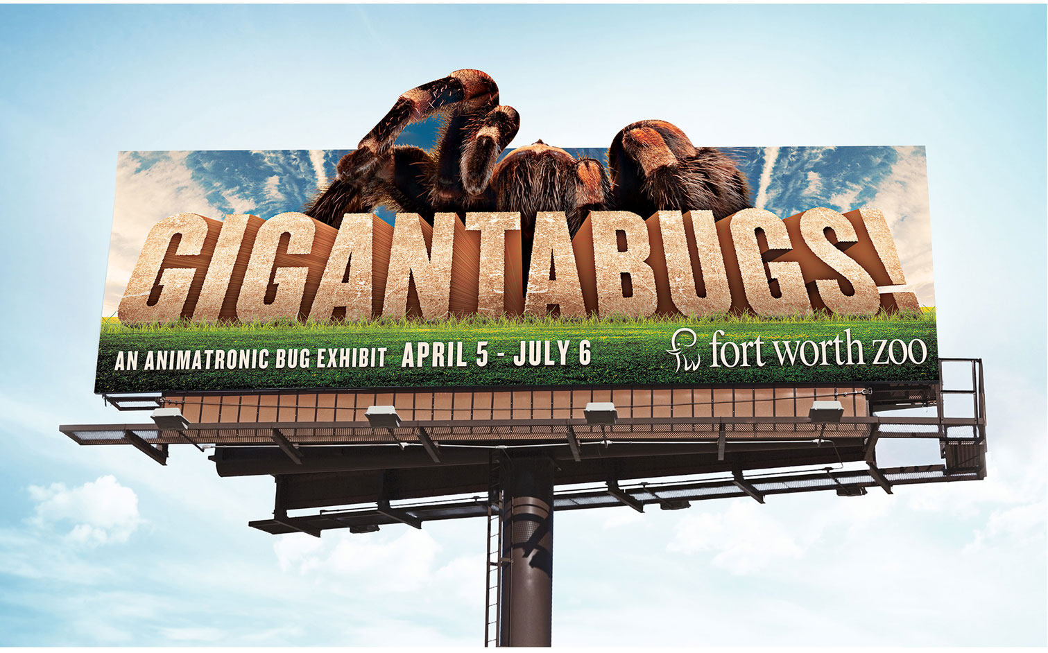
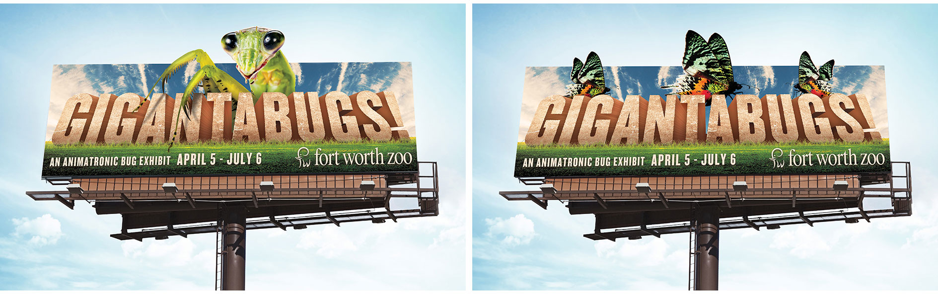
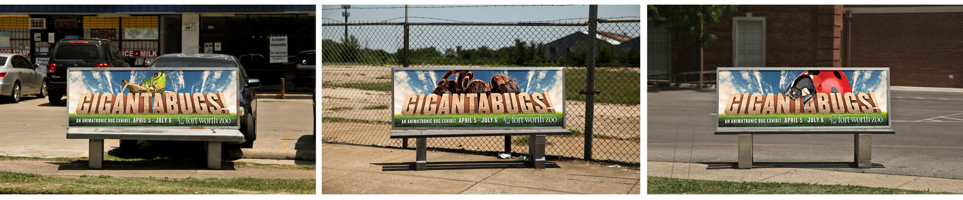
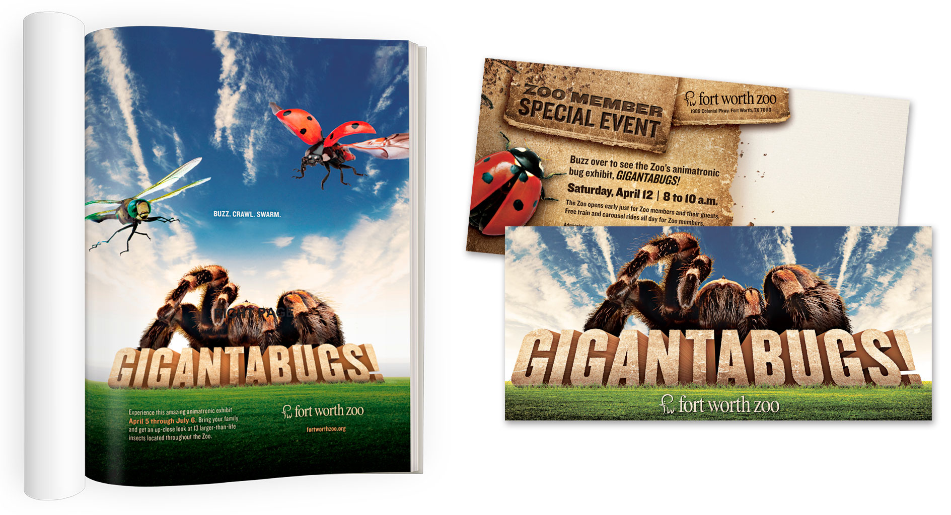
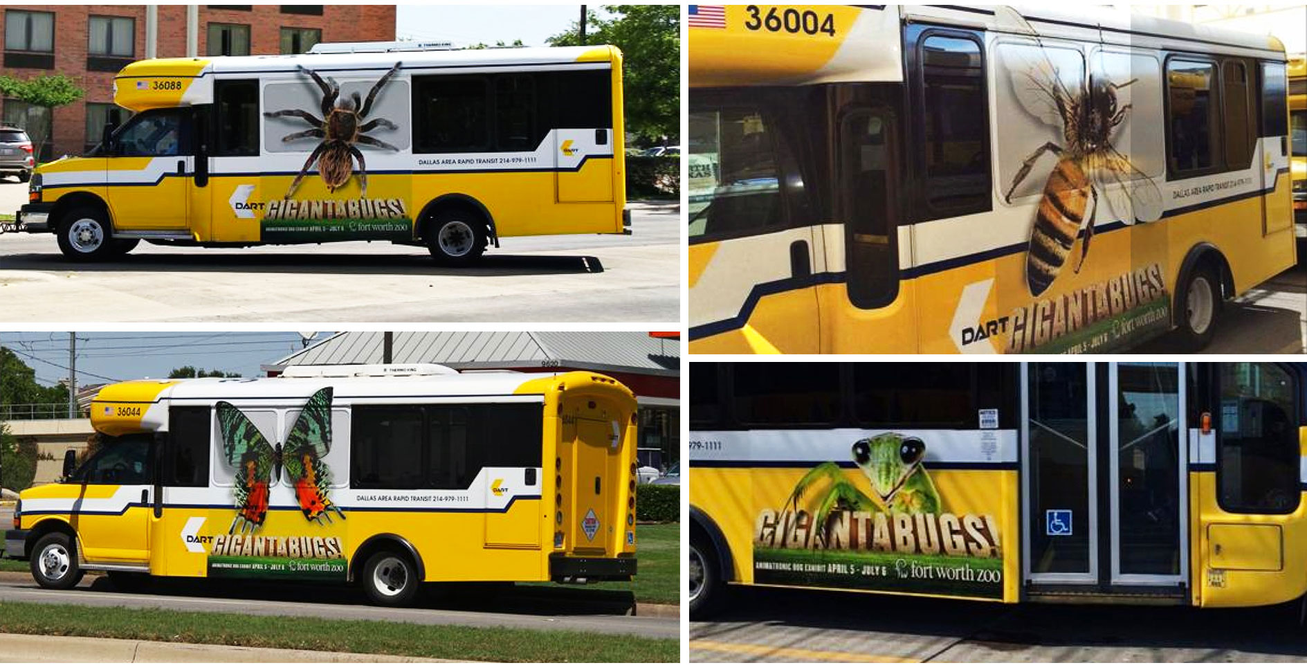
When the Fort Worth Zoo tells you they’ve got something big coming, you naturally go think elephant, giraffe, hippo – that kind of thing. Not even close. This time it was bugs. Enormous, animatronic bugs that moved, flapped, hissed and even sprayed. Thirteen of them would be located throughout the park to greet visitors who thought the lions and snakes would be the scariest animals they were going to see that day. Hahahaha was tasked with creating a name, identity and marketing materials for the exhibit. Most of us were fine with it. Certain people were less than enthused to learn of the existence of a car-sized spider in Fort Worth – even if it was a robot.
The Work
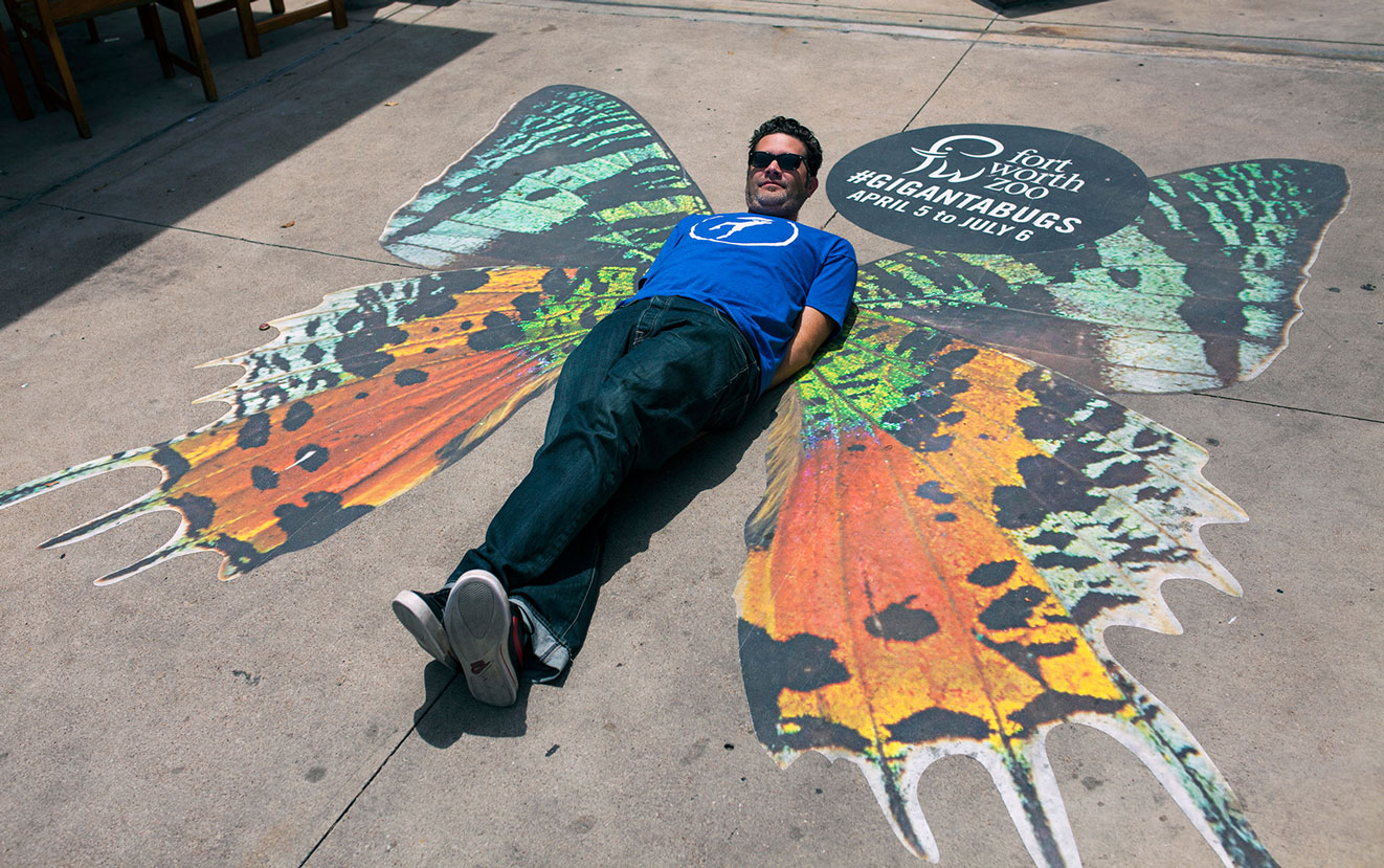
For the name of the exhibit, we went with GIGANTABUGS!, which was fun and playful but still conveyed exactly what people were in for. And since these bugs were larger than life, our marketing materials had to be “GIGANTA,” too. Our TV spot featured a variety of enormous bug shadows invading well-known Fort Worth spots. To further tease the exhibit, we applied ten-foot bug decals to a three-story building and the sidewalk in front of a busy grocery store.
The Results
This wouldn’t be a case study if our marketing didn’t work, so you probably saw this coming. Our TV spot and guerilla efforts received positive feedback and a lot of social shares leading up to the exhibit. And during the months the exhibit was open, Zoo attendance surpassed their goals by 5%.
Our friends over at TCU Baseball finished the regular season strong with a 38-15 record (17-7 in the Big 12). The Frogs will be the No. 2 seed going into the Big 12 Tournament. Good luck in the tournament and congrats on a great season!
The theme for this year’s Zoo Preschool is animal markings and habitats. And because the whole point of the preschool is to teach young kids about animals, we decided to make the direct mail piece interactive and educational. The piece featured a soft, natural color palate and a fun illustrated style, which was carried out across all media including the campers’ t-shirts. Any day we get to to create cartoon animals is a good day. And from the photos, it would appear these preschoolers found their favorite spot at the Fort Worth Zoo.
This year, the Hurst Conference Center came to us with a problem. As always, we came back with a solution. Problem: How can we increase our wedding and reception bookings and overcome the negative perceptions that engaged couples have of a conference center as a wedding venue? Solution: Develop a unique brand and identity for the Hurst Conference Center’s bridal market that sets it apart from competitors.
Our first step was to evaluate the local bridal market, the competitors and the unique attributes of the conference center. We then crafted the venue’s unique positioning, which guided us through the naming and identity development process. Our strategy was to develop an identity that conveyed simple elegance while highlighting the unique attributes of the grand ballroom while giving it a name that would sound good on wedding invitations. We developed several different names and designs and, in partnership with the client, landed on a name that highlighted the iconic fiber optic star-field chandelier located in the grand ballroom – Lumiere Ballroom at the Hurst Conference Center.
With the bridal identity developed, we executed the new brand in several collateral pieces to introduce it into the marketplace. Our goal was to differentiate the bridal marketing elements from the rest of the Hurst corporate/meeting planner marketing pieces. This meant pulling away from the traditional red and orange colors.
The bridal identity is set apart from the corporate HCC brand through the photography style and limited use of colors. De-saturated photography added an element of refined elegance to the space, while the use of black allowed the chandelier to stand out as a focal point within the venue. However, the corporate/meeting HCC brand and the bridal identity are tied together through the use of photography and the type family (Helvetica).
This year, every single Hahahaha employee had a hand in creating our Christmas card. 400-plus hand-stamped cards later, and this didn’t seem like such a great idea anymore. Take a look at how it all came together, and don’t be surprised if next year’s card is store-bought.
Merry Christmas from all of us at Hahahaha!
When the Fort Worth Opera asked Hahahaha to help them create fundraising collateral for a new opera they were commissioning based on the life of JFK, we were interested. When they needed it in a week, we started sweating. But c’est la vie in the ad world.
Fortuitously, the Amon Carter Museum in Fort Worth was running an exhibit of the artwork that had been put in his hotel room the night before he died. The new opera was to be set during the course of that one day in Fort Worth in 1963, so it proved an invaluable field trip for the creative team.
One of the pieces in the exhibit that caught our attention wasn’t a piece of fine art, per se, but a paper sign with welcoming the president and first lady in red letters and red glitter. This ultimately became the front cover of our collateral piece.
Not only did it harken back to that period of time, it was the perfect symbol of what the Fort Worth Opera’s new production—and those donating to it—were doing: welcoming Jack and Jackie back to Fort Worth.
We were able to produce the materials in time for a kickoff event held on the anniversary of his death. Previously named the Hotel Texas, what’s now the Fort Worth Hilton is where JFK spent his last night. It was the perfect time and place to announce the new opera, which is set to open in the 2016 opera season.
When the Fort Worth Zoo decided to update their brand messaging for 2013, Hahahaha decided to pick up where our last campaign left off – clean, uncluttered imagery that kept the animals as the stars of the show.
We saw this new campaign as an opportunity to communicate the experiential and entertainment value the Zoo offers by reminding the people of Fort Worth and surrounding areas of their wilder neighbors. We did this by trying to keep animals as close to actual size as possible throughout the varying media.
We kept backgrounds simple to further call attention to the animals as they cropped up around their “natural habitat” of Fort Worth.
Our approach led us to the headline: Real. Fun. On the one hand, it’s self explanatory, but it’s also a subtle comparison to movies, video games and other virtual forms of entertainment.
Our poster for the 2013 Zoo Ball features custom illustration by creative director Todd Lancaster. In keeping with the event’s psychedelic theme, we printed this poster in the style of blacklight posters from the ’70s using UV inks and purple flocking for a textural element. Posters were delivered in a tube that included a blacklight bulb, so the recipient could get the full effect. Other printed materials for the event were illustrated in the same style to further the theme.
We created this spot for TCU last summer for their inaugural season in the Big 12. With TCU’s first game tomorrow against LSU it felt like a good time to post the spot. We were very proud to work with TCU on this project and be apart of the historic moment for the university.
In anticipation of the Clearfork Main Street Bridge opening, which would open up traffic through Clearfork for the first time, we wanted to develop on-site signage that would call motorists’ attention to sheer size of the land and tease what was to come.
Rather than putting up traditional banners or billboard signage, we created a concept that used larger than life words to describe the soul of Clearfork. The words were placed at strategic points on the property and were made to appear as if they had grown out of the land. Thus, we referred to the project internally as the Clearfork word crops.